With the eurodollar futures curve slightly inverted, the implications of it are somewhat specific to the features of that particular market. And there’s more than enough reason to reasonably suspect this development is more specifically deflationary money than more general economic concerns. What I mean is, those latter have come later (“growth scare”) only long after the world’s real money truly began to dry up. Money then economy. How do we know? For one, sequence of events. And because of that sequence, this means something important about the balance of future risks. Overall, the eurodollar futures twist doesn’t leave for us anything that’s good on either of those accounts, yet by itself and to such a small degree this doesn’t indicate a full-blown red alert
Topics:
Jeffrey P. Snider considers the following as important: 5.) Alhambra Investments, bonds, currencies, Deflation, deflation potential, dot com bubble, economy, Featured, Federal Reserve, Federal Reserve/Monetary Policy, inflation, inversion, Markets, newsletter, QE, taper, U.S. Treasuries, Yield Curve
This could be interesting, too:
Nachrichten Ticker - www.finanzen.ch writes Die Performance der Kryptowährungen in KW 9: Das hat sich bei Bitcoin, Ether & Co. getan
Nachrichten Ticker - www.finanzen.ch writes Wer verbirgt sich hinter der Ethereum-Technologie?
Martin Hartmann writes Eine Analyse nach den Lehren von Milton Friedman
Marc Chandler writes March 2025 Monthly
| With the eurodollar futures curve slightly inverted, the implications of it are somewhat specific to the features of that particular market. And there’s more than enough reason to reasonably suspect this development is more specifically deflationary money than more general economic concerns. What I mean is, those latter have come later (“growth scare”) only long after the world’s real money truly began to dry up.
Money then economy. How do we know? For one, sequence of events. And because of that sequence, this means something important about the balance of future risks. Overall, the eurodollar futures twist doesn’t leave for us anything that’s good on either of those accounts, yet by itself and to such a small degree this doesn’t indicate a full-blown red alert by any means. |
|
| If that inversion were to be equaled by one in the US Treasury yield curve, for example, then both of those together would take our concern to a whole other level.
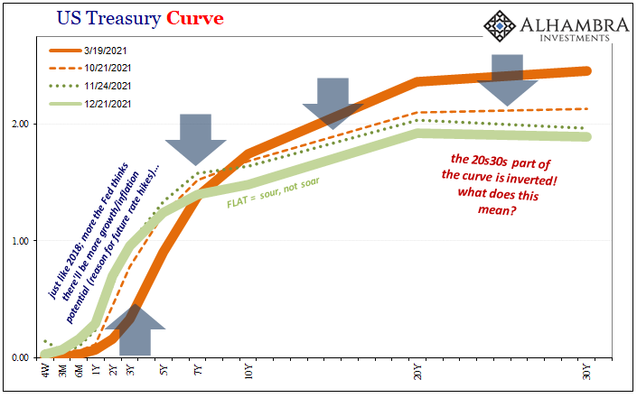
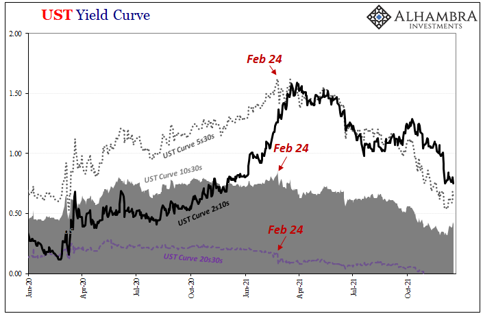
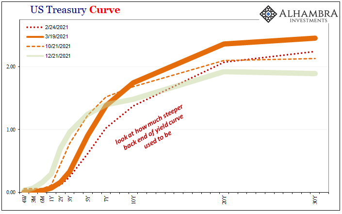
But the yield curve is already inverted. It has been since late October. You may not have heard anything about it on the news or somewhere on Facebook, the thing’s upside-down all the same. Take a look: No, this is not the attention-grabbing difference between the 2-year and the 10-year (2s10s). Still, the yield on the 20-year bond is more than the rate for the long bond 30s and has been for nearly two months. As it turns out, this special inversion case is its own quirk. In fact, historically speaking, during the nineties and early 2000s before the long bond was retired this situation was commonplace. What happens is a liquidity premium demanded by the market to hold less traded 20s rather than highly liquid 30s. However, this doesn’t mean the long end of the yield curve gives us little or no information beyond Treasury market idiosyncrasies. Moving beyond the 20s and 30s, the far notes and bonds tell us a lot about the state of money, markets, and the economic projections pieced together from both (Fisherian decomposition of yields into inflation/growth expectations).
Using a variety of calendar spreads focused down the curve, including the 20s30s but also the 5s30s or 10s30s, the longer end has consistently provided the best early warning signal. While the more famous 2s10s have stolen the mainstream with its easy comparison, the 5s30s or even the 10s30s have pointed the way for those times when the public takes note of those 2s10s. |
|
| Flattening, in other words.
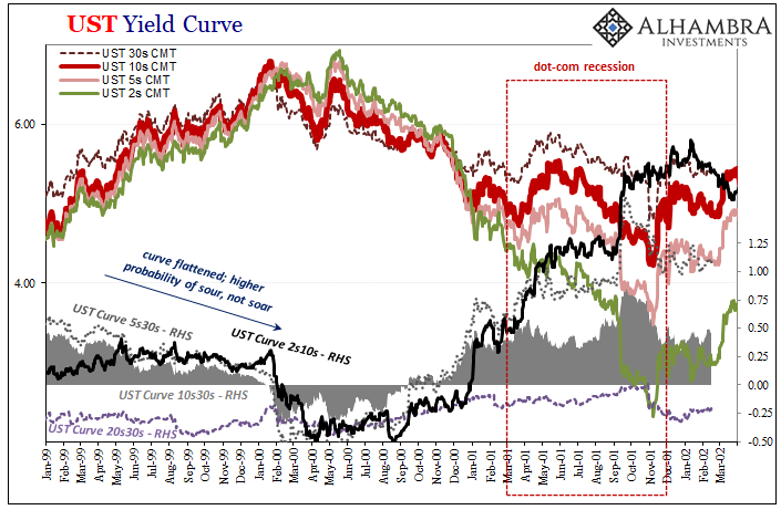
In Fisherian terms, long run growth and inflation expectations are reduced because of whatever issues today plaguing the bond market considering, and discounting, the future implications of whatever is happening right now. Thus, it makes perfect sense why the long end of the yield curve would twist backward before the middle or short parts. The more distant future is highly unsettled, so if there’s any rise in perceived uncertainty today then it stands to reason the more distant future becomes doubly (or triply) so. Margins for error are slimmer because errors get multiplied the more time. Let’s start with a specific case: the late dot-com era. In the wake of the Asian Financial Crisis (the precursor regional dollar shortage to the 2008 Global Financial Crisis), the outer parts of the Treasury curve had been flattening. Alan Greenspan’s Fed, as is usual, feared a rise in inflation, a hysterical perception of future consumer prices while the bond market was more attuned to growing potential for economic problems starting with the huge valuation mismatch in stocks and what that might potentially mean (not inflation). The long end of the yield curve flattened out noticeably as the “maestro’s” Fed continued to raise rates convinced of much higher inflationary risks. |
|
| It was only February 2000 when the shorter end of the curve began to change, too, as stocks peaked and then fell off thereby choking off – as the bond market had feared – a good chunk of marginal economic (therefore inflation) capacity.
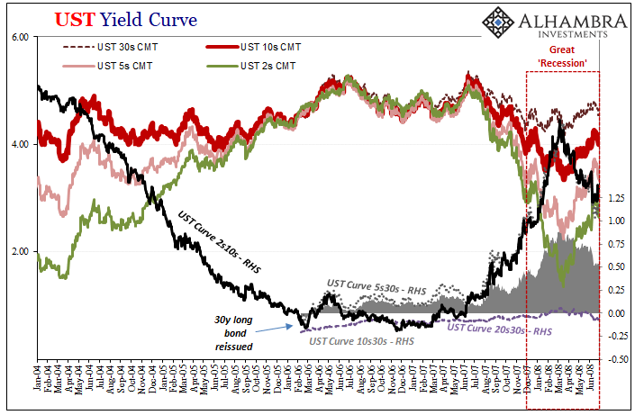
It was the rising potential for a burst stock bubble throughout ‘99 which had flattened the long end. When the dot-coms did eventually pop, then the whole curve inverted. With recession looming toward the end of ’00, the curve only then proceeded to “bad” steepening up and down its whole length, short to long. Unfortunately for our review here, the Treasury Department stopped issuing 30-year long bonds in February 2002, so we don’t have a complete record of how the extremes at the long end of the curve might have performed in the runup to the Great “Recession.” By the time Treasury restarted 30s four years later in February 2006, all these same calendar spreads were already upside down. We can only infer and speculate that like the pre-recession period before 2001, the 5s30s, 10s30s, even 20s30s might have flattened long before the short end fell the same way (including eurodollar futures later in 2006). |
|
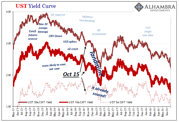
| The sequence on the other side of the Global Financial Crisis, this was preserved and repeated. It would consistently be at the long end where changes in perceptions registered first – despite QE’s (or because of growing skepticism about QE and the perceived likelihood for its failures).
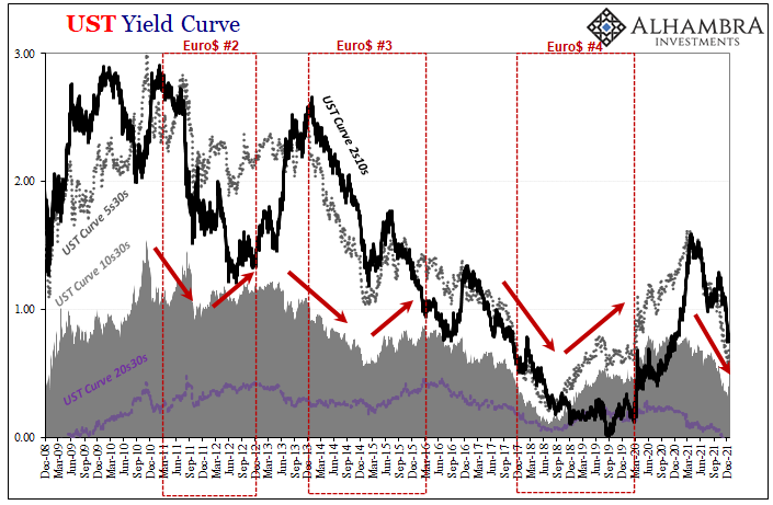
For example, though it’s somewhat difficult to easily perceive on my chart above, in the interim leading up to Euro$ #2 in 2011, the 5s30s part of the yield curve had peaked on November 10, 2010, the same date as the steepest for the 10s30s. This wasn’t even one full week after QE2 had been restarted! Just as the Federal Reserve was ramping up its second round of bond buying, the market was already detecting and trading rising concerns over its effectiveness (proven correct) given more immediate and pressing concerns in global monetary conditions (especially collateral). |
|
| It would take the 2s10s part of the curve a further three months for the middle to begin flattening.
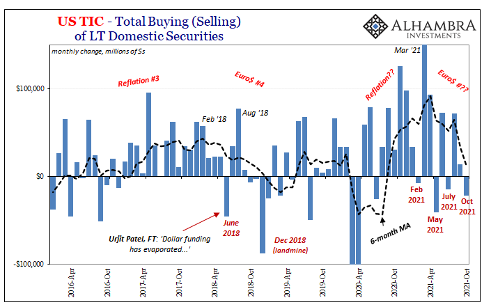
We’d see basically the same thing repeat for 2013’s taper tantrum celebration. From the very start of it, May 2013, the 10s30s in particular had already topped out (steep). Here’s the punchline: the long end of the curve has demonstrated this consistent ability to detect and discount by price and interest rate the slightest disturbances which has produced an early signal for deflationary potential. The resulting flattening out at the far end of the yield curve, ignored by practically everyone, has been repeatedly and highly useful, true to form. This includes, by the way, the oddness of the 20s30s. We can and should dismiss the inversion of that specific calendar spread, whether it is or not is immaterial given the technical nature of it. It’s not if or when the 20s go above the 30s, it is whether that same motion of 20s relative to 30s performs the same motions further up the curve. Looking back on 2021, by every single mainstream interpretation this was the year of inflation, too much money, therefore double hawk taper and triple hawk rate hikes for 2022. Yet, from the perspective of the far out yield curve spaces, nearly this whole year has been the opposite with rising backward or deflationary potential almost from the very beginning. But not quite the beginning; instead, as you can plainly see above, the negative twisting and distortions in the important long end shapes all – including the 20s30s – date back specifically to what happened the day after February 24. Yep. Fedwire. The “growth scare” only comes much later, long after the world’s shadow money marketplace was hit by something even more shadowy. Ostensibly, on February 25, Treasury markets were rocked by a “bad” 7-year note auction which at the time was said to be more of the same inflation fears.
No way. This was dealers stepped out, and dealers, in every capacity, they are the world’s money.
|
|
| Closing in on nine months later, still February 24 all over the fixed income map including, importantly, the long end curve shape – which has led into the eventual eurodollar curve inversion along with all the other stuff which showed up late in October.
February 24 wasn’t omicron; it couldn’t even have been delta corona. No, here’s what I wrote on April 24:
The sounds of that train barreling towards us have only gotten louder and louder. Inflation by account of CPI’s and the like has only gotten worse, yet bonds have been changed and no longer pay much attention to those. Deflation in money, as what all this stuff represents, first means transitory “inflation” before becoming something else. Furthermore, sequence of events, we also know beyond a doubt it is monetary in nature, it has first contributed much if not most to the “growth scare” (ask China and its RRRs), and, most of all, it isn’t going away. These signals have only gotten stronger, proliferated, more thorough and consistent ever since that particular day way back in late February. We still don’t yet know what that downside might look like, only that it has become probable to the point of likely. There be landmines. |
So, in that sense, yes, the 20s30s inversion does mean something important if only because it has been a part of the long end’s increasingly more detailed and thorough discrediting of Inflation Hysteria #2.
Tags: Bonds,currencies,Deflation,deflation potential,dot com bubble,economy,Featured,Federal Reserve/Monetary Policy,federal-reserve,inflation,inversion,Markets,newsletter,QE,taper,U.S. Treasuries,Yield Curve

