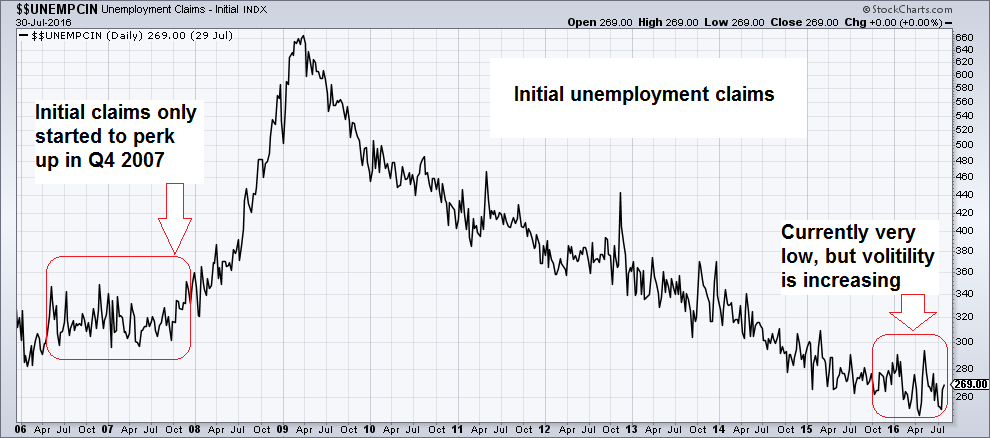
Another Strong Payrolls Report – is it Meaningful? This morning the punters in the casino were cheered up by yet another strong payrolls report, the second in a row. Leaving aside the fact that it will be revised out of all recognition when all is said and done, does it actually mean the economy is strong? As we usually point out at this juncture: apart from the problem that US labor force participation has collapsed (i.e., millions of unemployed people have been defined out of existence), employment is a lagging economic indicator. Quo vadis, economy? Image credit: Paul Raphaelson – click to enlarge. Nevertheless, payroll data and initial claims usually tend to give some advance warning ahead of recessions. As long as they remain strong, it is fair to conclude that a recession is probably still a few months away at a minimum. Note though that the warning signs from these indicators usually come very late in the game. Monthly change in non-farm payrolls: two strong reports in a row. As Mish notes, at least one market does not believe the message – rate hike odds barely increased – click to enlarge. The only reason why markets are paying a lot of attention to the flawed payrolls report is that it is held to influence central bank policy.
Topics:
Pater Tenebrarum considers the following as important: actual dollar value, Debt and the Fallacies of Paper Money, diffusion indexes, establishment payrolls, factory orders, Featured, Gross Private Domestic Investment, household employment survey, Initial unemployment claims, inter alia, Michael Pollaro, mixed signals, newsletter, Payroll Report, Steve Saville, Total business sales
This could be interesting, too:
Nachrichten Ticker - www.finanzen.ch writes Die Performance der Kryptowährungen in KW 9: Das hat sich bei Bitcoin, Ether & Co. getan
Nachrichten Ticker - www.finanzen.ch writes Wer verbirgt sich hinter der Ethereum-Technologie?
Martin Hartmann writes Eine Analyse nach den Lehren von Milton Friedman
Marc Chandler writes March 2025 Monthly
Another Strong Payrolls Report – is it Meaningful?This morning the punters in the casino were cheered up by yet another strong payrolls report, the second in a row. Leaving aside the fact that it will be revised out of all recognition when all is said and done, does it actually mean the economy is strong? As we usually point out at this juncture: apart from the problem that US labor force participation has collapsed (i.e., millions of unemployed people have been defined out of existence), employment is a lagging economic indicator. |
|
| Nevertheless, payroll data and initial claims usually tend to give some advance warning ahead of recessions. As long as they remain strong, it is fair to conclude that a recession is probably still a few months away at a minimum. Note though that the warning signs from these indicators usually come very late in the game. | |
| The only reason why markets are paying a lot of attention to the flawed payrolls report is that it is held to influence central bank policy. Below we will inter alia show you just how flawed it currently is. If one wants to know what the state of the economy is, or where it is likely going next, one needs to look at other data.
Having said that, always keep in mind that the “measuring” of the performance of economic aggregates is fraught with a great many problems. The economy is a lot less “measurable” than the economics profession claims or seems to assume. Moreover, the collection of economic statistics – which are generally completely meaningless for the business people who create society’s wealth – serves mainly to give the State a reason to meddle with the economy by means of various interventions. With that caveat out of the way, let us look at a few data points anyway. ? |
|
Warning SignalsOur friend Michael Pollaro, keeper of the TMS series and a keen observer of the economy, has recently sent us a number of updated charts. We present a selection of them below. Something very strange has recently happened with the national manufacturing ISM data. Not only are they regularly at odds with the PMI data released by Markit, but they are also at odds with numerous other data points. The first chart below has annotations by Michael – it shows ISM new orders and industrial production. The interesting thing is that similar bounces after several very weak readings occurred shortly before the most recent two recessions started. These bounces turned out to be head fakes – will this time be different? |
|
| Is there any reason to believe it could be a head fake? After all, the above is just squiggles on a chart. When new orders are looking up, it usually means that no recession is imminent. Perhaps the preceding weakness was the head fake? We actually believe that in this case, the idea that we are looking at a head fake has a lot of merit.
Consider the following chart, which shows real gross domestic private investment (RGPDI). As Steve Saville, author of the Speculative Investor newsletter points out (as an aside, we highly recommend his letter):
|
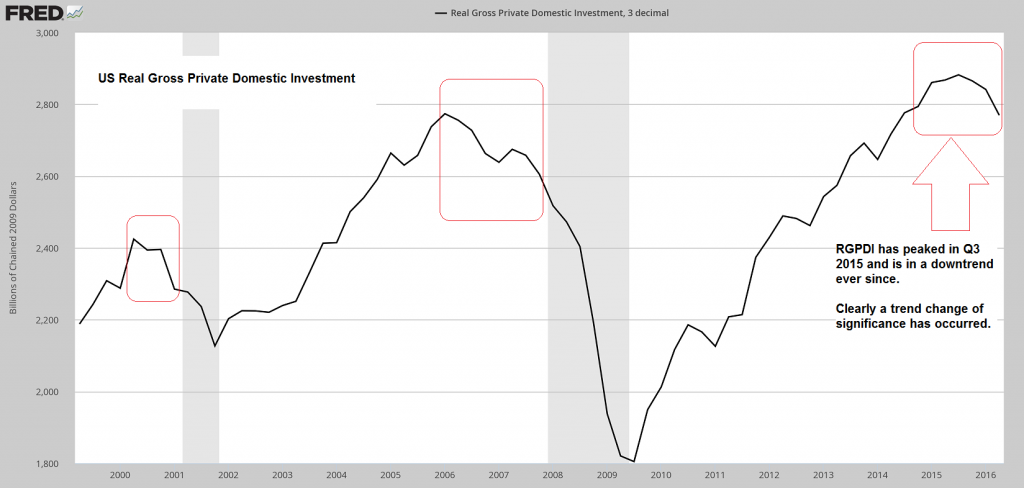 A significant trend change in RGPDI has occurred. This is a major recession warning. The lead times do of course vary though, and the current situation is characterized by a number of unique aspects. For instance, this is happening in spite of money supply growth remaining quite brisk – click to enlarge. |
| This indicator certainly says that we should not dismiss the “head fake” idea – and it is not the only one. As noted above, something is odd about the strength in the national ISM data. This is a diffusion index, and as such can obviously at times be misleading – then again, it has a fairly good track record as a leading indicator.
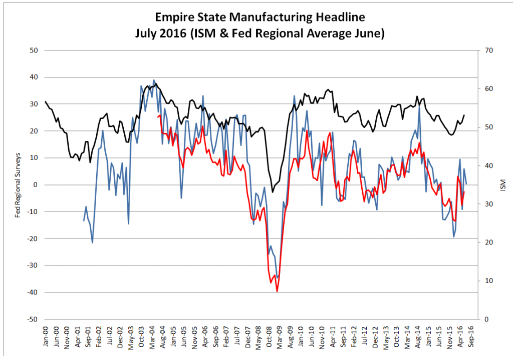
What is odd is that it diverges so much from many other related data points – including other diffusion indexes. This is what the next chart illustrates. The district manufacturing surveys conducted by the Fed are also diffusion indexes and normally they tend to be fairly well aligned with ISM data, although they are more volatile. |
|
| A very large gap has developed between the ISM and the regional survey headline data though (similarly, a large gap between ISM and Markit PMI data has developed, so this is not just some fluke). Generally, ISM data have been much stronger.
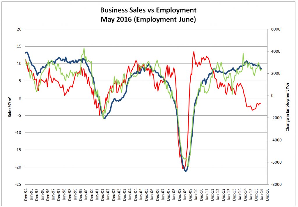
It is not only the ISM that is at odds with other data points though – the same is true of employment data. The next chart compares total business sales to the payrolls as well as the household employment report. Since business sales simply add actual dollar revenues, we would contend that it must be the employment data that are problematic. Business sales may simply be leading employment of course, but once again, we are looking at a huge gap. Eventually, something is going to give. |
|
| A similar picture emerges when we compare the relatively strong ISM to the change in the actual dollar value of factory orders. The next chart illustrates this – it shows the change in the dollar value of durable goods and factory orders (manufacturing industries) and compares them to the ISM data. It has to be stressed that the latter are the result of a survey subject to a number of limitations, while the former are simple bean counting, i.e., reality. The dollar value of orders is what it is.
Naturally, there data don’t have to be perfectly aligned all the time – in fact, occasional divergences and leads and lags are not uncommon. Once again though we are looking at a strangely persistent and very wide gap. |
|
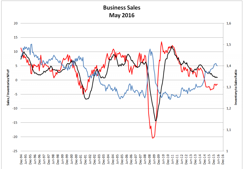
| Looking at total business sales compared to inventories and the resulting inventories-to-sales ratio, we get the impression that there is substantial weakness baked in the cake going forward as well. Although inventories have decreased, this has not kept pace with the decline in sales. | |
| As a result, the inventory-to-sales ratio remains at an unusually elevated level – in fact, one would normally expect to see such a reading in the early stages of a recession: | |
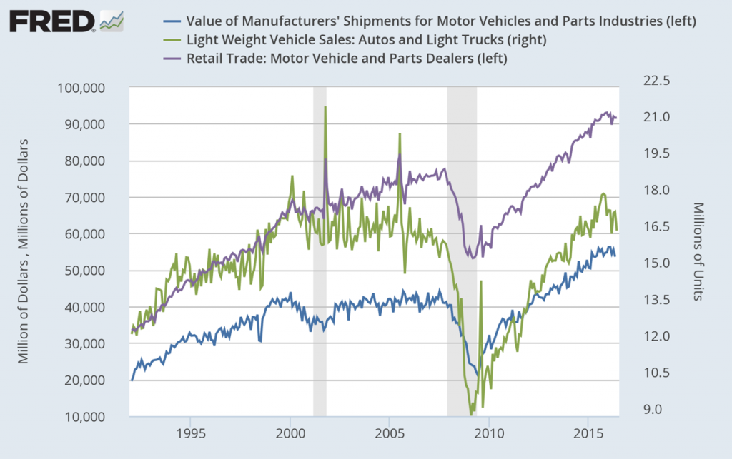
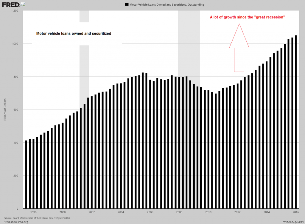
| An industry that has done exceptionally well in the recovery was the car industry. We suspect that it has been a major factor in supporting GDP growth. The problem is, this has happened on account of a major expansion in lending, quite a bit of it of the sub-prime variety. It appears as though car industry growth is beginning to stall out: | |
Additional Data PointsLastly, here is a look at three more general data points. First of all – while keeping in mind that GDP is an especially flawed measure of “growth” – is is noteworthy that GDP growth has trended down rather noticeably in recent quarters. This does not tell us anything about the future of course, but given the decline in RGPDI and the sharp slowdown in gross output we have previously discussed, it seems likely that this trend will continue. Similarly persistent downtrends in quarterly GDP growth could be observed ahead of the last two recessions. |
|
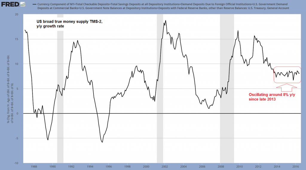
| Money supply growth remains at a historically strong level though – and given that the Fed is no longer engaged in “QE”, it has to be driven by commercial bank credit growth. While money supply growth remains strong, it is well below its post-crisis peak levels and has moved sideways for quite some time. Obviously though, it has so far been sufficient to keep asset prices elevated and boost “activity” enough to keep most aggregate economic data in positive territory. | |
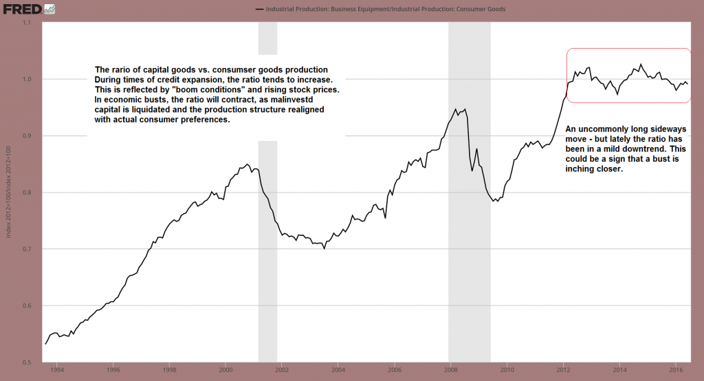
| And finally, here is the most recent update of our capital vs. consumer goods production ratio, which serves as a proxy for whether factors of production are increasingly drawn toward the higher or lower stages of the production structure.
The recent decline in the ratio would normally suggest that the economy is inching closer toward a bust, but obviously this could still be arrested or reversed by renewed monetary pumping – at least as long as the pool of real funding isn’t exhausted yet. |
Conclusion
Overall, the “mixed signals” backdrop that has been in evidence for quite some time continues to prevail. And yet, we can see that a number of data points remain quite weak or are deteriorating further (particularly RGPDI).
Strong payrolls data are not a reliable indicator of future economic growth – and considering that money supply growth remains at more than 8% y/y, current economic data look actually exceptionally poor (normally more pronounced boom conditions would be expected). Any slowdown in credit growth will quickly sink the good ship US economy.
Charts by: St. Louis Federal Reserve Research, Michael Pollaro, StockCharts


