Summary: The major currencies but the Canadian dollar peaked Jan 25-26. The Australian dollar has fallen the most since peaking. Many are still viewing the dollar’s recovery as technical in nature and not a turn in the trend. This Great Graphic was created on Bloomberg. It shows five major currencies against the US dollar this year. To avoid giving a misleading impression, the currencies are index to start this year at 100 and all the currencies are quoted in the European style of how many dollars the currency purchases. These kinds of charts are not so much for trading, but they help illustrate the relative moves that can be masked by nominal price changes. The green line is sterling. It clear
Topics:
Marc Chandler considers the following as important: AUD, CAD, EUR, Featured, FX Trends, GBP, Great Graphic, JPY, newslettersent
This could be interesting, too:
Nachrichten Ticker - www.finanzen.ch writes Die Performance der Kryptowährungen in KW 9: Das hat sich bei Bitcoin, Ether & Co. getan
Nachrichten Ticker - www.finanzen.ch writes Wer verbirgt sich hinter der Ethereum-Technologie?
Marc Chandler writes March 2025 Monthly
Mark Thornton writes Is Amazon a Union-Busting Leviathan?
Summary:
The major currencies but the Canadian dollar peaked Jan 25-26.
The Australian dollar has fallen the most since peaking.
Many are still viewing the dollar’s recovery as technical in nature and not a turn in the trend.
|
This Great Graphic was created on Bloomberg. It shows five major currencies against the US dollar this year. To avoid giving a misleading impression, the currencies are index to start this year at 100 and all the currencies are quoted in the European style of how many dollars the currency purchases. These kinds of charts are not so much for trading, but they help illustrate the relative moves that can be masked by nominal price changes.
The green line is sterling. It clear outperformed in the second half of January, but that phase appears over. The white line is the yen, and it is the strongest of the currencies we charted. It is up just shy of 3% year-to-date. The yellow line is the euro. It is up about 2.4% so far in 2018. Both sterling and the euro peaked on January 25, the line chart tracks closes rather than intraday moves. The yen peaked the next day. The fuchsia line is the Australian dollar and the red line is the Canadian dollar. These are the weakest of the majors this year. The Aussie is up 0.45% and the Canadian dollar is up 0.2%. The Australian dollar peaked on January 26, the same day as the yen, but since peaking, it has fallen the most (~2.3%) followed by sterling (~-1.85%). The Canadian dollar peaked on January 31 on an intraday basis. The decline since the peak matches sterling’s 1.85% decline. Taken together, one gets a distinct impression that after an impressive rally to start the year, the currencies are rolling over. The extent of the dollar’s advance is not yet clear. However, the Dollar Index is surpassing the 38.2% retracement of this year’s decline (~90.05) and is pushing above the 20-day moving average for the first time since a few days before Christmas. The 50% retracement is found near 90.55. A move above 91.00 may be needed to give the dollar bears second thoughts. Until then, the balance of opinion seems to view the dollar bounce as a simple technical correction. |
JPY/USD Currency, Jan - Feb 2018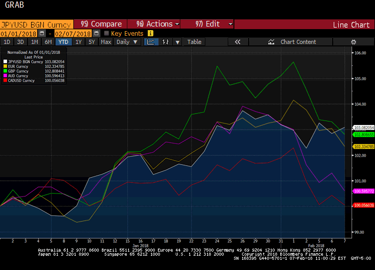 - Click to enlarge |
Tags: #GBP,$AUD,$CAD,$EUR,$JPY,Featured,Great Graphic,newslettersent