Summary: The relationship between stocks and bonds does not appear to have changed much. It is difficult to eyeball correlations. Question the meaning of a chart that has two time series and two scales and. This Great Graphic comes from Bloomberg. It is a more complicated look at the relationship between the US stocks and bonds. In particular, we are looking at the S&P 500 and the 10-year US generic yield. There are three separate charts here. The top one is a simply line chart. The S&P 500 is the orange line and the 10-year yield is the white line. This chart has been shown ad nauseam. It is misleading. It shows the two variables on the same chart, but with two different scales. The eye naturally goes to
Topics:
Marc Chandler considers the following as important: Featured, FX Trends, Great Graphic, newslettersent, SPY, Stock markets, TLT, USD
This could be interesting, too:
Nachrichten Ticker - www.finanzen.ch writes Die Performance der Kryptowährungen in KW 9: Das hat sich bei Bitcoin, Ether & Co. getan
Nachrichten Ticker - www.finanzen.ch writes Wer verbirgt sich hinter der Ethereum-Technologie?
Marc Chandler writes March 2025 Monthly
Mark Thornton writes Is Amazon a Union-Busting Leviathan?
Summary:
The relationship between stocks and bonds does not appear to have changed much.
It is difficult to eyeball correlations.
Question the meaning of a chart that has two time series and two scales and.
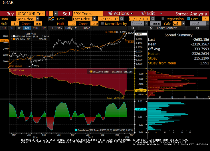
| This Great Graphic comes from Bloomberg. It is a more complicated look at the relationship between the US stocks and bonds. In particular, we are looking at the S&P 500 and the 10-year US generic yield.
There are three separate charts here. The top one is a simply line chart. The S&P 500 is the orange line and the 10-year yield is the white line. This chart has been shown ad nauseam. It is misleading. It shows the two variables on the same chart, but with two different scales. The eye naturally goes to where the lines cross. Eureka: This shows that while stocks rallied alongside with rising yields, but then choked off the bull market. Beware of optical illusions and curve fitting. The lines did not cross, that is the optical illusion caused by curve fitting. There is nothing that says 2900 in the S&P 500 is the same as 2.90% yield of the 10-year note, or the 2700 in the S&P 500 is aligned with 2.50% yield. Ultimately, the only thing can be said about the top chart is that bond yields remains firm when the S&P 500 dropped. If possible, the second chart is even less useful. It is created by simply subtracting the price of the S&PO 500 from the yield. It is arithmetic difference of the S&P 500 and 10-year yield. |
Stocks and Bonds, Mar 2016 - 2018 |
The lowest of the three charts is the most useful. It shows the correlation between the S&P 500 and the US 10-year yield. The correlation was done on the level of the two variables and covers the past two years. The correlation over the past 60 days is 0.49. It has been positive since last September. There were three distinct periods last year that the correlation was inverse and four such period in 2016. The blue bar chart shows the distribution of the correlation and there are three modes (clusters of frequencies); near the top, a bit lower than the current correlation, and a small inversion. This is to say that the relationship between bonds and equities seems well within what has been experienced over the past couple of years.
We can conduct the correlation on the percentage change of each time series. This correlation is often more important for investors. It helps inform one of not just direction by magnitudes of the co-movement. Running the calculation on the percentage change of the S&P 500 and the 10-year yield generates a correlation of 0.37 over the past 60-day. That is to say that a 10-percentage move in the S&P 500 translates to a 3.7% change in the Treasury yield.
The correlation on the percentage change appears to have been somewhat more stable than the correlation on the levels. Over the last two, it has been negative for one period–September through November 2016. It has rarely been above 0.60 or below 0.10. The problem with this methodology is that it forces one to take a percentage of a percentage (yield), which can produce some strange and unhelpful results.
Nevertheless, both ways of calculating the correlation between stocks (S&P 500) and yields (10-year) have converged and are telling investors essentially the same thing. Despite the equity swoon and the firmness of US yields, the relationship between the two markets does not appear unusual. Interestingly, the correlation on a percentage change basis is somewhat greater of the past 30 days (0.46) than the past 60 days (0.37). The same is not true about the correlation done on the level of the two. There the 30-day correlation has become inverted. Over the past two years, this is the ninth time that the 30-day correlation has become negative. When it has become inverted, the inversion has tended to be deeper and last mostly two or three weeks, though there were a couple of times where the 30-day inversion lasted closer to two months.
Tags: #USD,$TLT,Featured,Great Graphic,newslettersent,SPY

