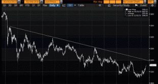
Keynes and others may have referred to gold as a barbarous relic, but many investors continue to track it. In early January, we warned that gold appeared to be breaking out of a short-term bottoming pattern.It had taken out a three-month downtrend line, which we suggested was part of a triangle pattern. Gold also traced out a double bottom pattern. The triangle pattern pointed to a move toward $1110 and the double bottom projected to around $1135. The yellow metal poked through $1157...
Read More »Great Graphic: Falling Equities and US Treasuries Blunt Impact of BOJ’s Surprise
The yen is the strongest currency today. Many are still referring to it as a safe haven. However, this strikes us as a misuse of the concept. Investors are not flocking to the yen to find quiet place to ride out the storm. Rather the yen's strength is a reflection of the turmoil. As we have explained the yen and euro have been used to finance the purchases of other assets. As those assets are liquidated, the funding currency is bought back. The dollar, euro and yen are the most...
Read More »Great Graphic: World Equities and Oil
Equities and oil continue to be moving in the same direction. During the first few weeks, they were moving down together and now up together. It is frustrating for asset managers. Large cap and small cap stocks moving together as if everything is being tarred with the same brush. We continue to try to tease out the relationship between equities and oil prices, but there is some underbrush needed to be gotten rid of before we can have a clear space to share our tentative...
Read More »Great Graphic: Canadian Dollar Resilience in Face of 7% Drop in Oil
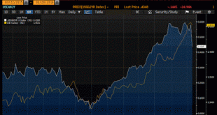
This Great Graphic, composed on Bloomberg, shows two-time series. The white line is the premium the US government pays to borrow over the Canadian government for two years. The yellow line the US dollar against the Canadian dollar. Even though it appears to be a good fit, our eyes can be deceived, and Bloomberg automatically aligns the scales to show the best bit. However, here the fit is very good. We ran some correlations to probe the robustness of the fit. Over the last 60...
Read More »Great Graphic: Shanghai Composite and the S&P 500
I was canoeing recently. When I looked that oar in the water, it looked bent. It wasn't my equipment, and I am a novice. I cursed to myself and quickly pulled the oar from the water. I smiled. It was not bent. It was an optical illusion. There is a chart that is making the rounds. It shows the S&P 500 moving in tandem with the Shanghai Composite. I have tried to recreate the Great Graphic on Bloomberg. It does look like a good fit. but do no be misled. The two different...
Read More »Great Graphic: Euro Flirting with Downtrend Against Sterling
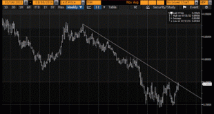
The euro appears to be carving out a bottom against sterling. This Great Graphic, created on Bloomberg, is a weekly bar chart of the cross. We drew in the trendline off the high in H2 13. It catches a few highs in 2014 and is testing it this week. Last year, the euro traded mostly between GBP0.7000 and GBP0.7500. A triple bottom near GBP0.7000 appears to have been recorded. This is a derivative of a head and shoulders pattern. Although the trendline may be violated, we advise...
Read More »Great Graphic: Possible Head and Shoulders in Dollar-Yen
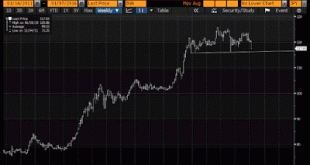
The dollar has broken down against the yen. Although many talk about safe haven role for the yen, this seems to be a misconception. Investors are not buying the yen to escape the turmoil of the markets. The yen's strength itself is the turmoil. The yen was used as a funding currency to purchase risk assets, like equities, emerging markets, etc. As those risk assets are being liquidated, the funding currency is bought back. Earlier today, the Ministry of Finance reported the...
Read More »Great Graphic: The Euro Touchstone
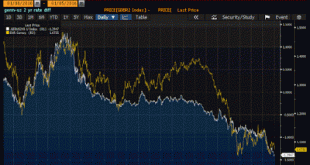
Chart 1 This Great Graphic is a favorite of mine. Created on Bloomberg, it depicts the 2-year spread between Germany and the US on two-year money (white line) and the euro-dollar exchange rate (yellow line). The chart covers the past five years. The scales of the two time series are different so it makes little sense to claim that euro gravitates toward the rate differential. And there have been some significant misalignment, like in 2013 and into 2014. However those periods seem...
Read More »Great Graphic: Visualizing the Refugee/Asylum Seekers in Europe
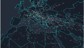
The Greek crisis that dominated the European discussion in the first half of the year was barely ending when attention turned to the refugee problem. While it often seemed that all of Europe was united against Greece, the refugee problem is significantly more divisive, though southern Europe, especially Italy and Greece are the front lines. In the financial crisis, we emphasized the linkage between solvency and sovereignty. The less solvent a country was, the more sovereignty was...
Read More »Great Graphic: US Bill Yields and Fed Hikes
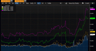
There are many investors and observers who do not think the Fed ought to raise interest rates today. The Fed's targeted inflation measure, the core PCE deflator, stood at 1.3%, well below the 2% target. They see the fresh sell-off in oil prices and are more concerned disinflation than inflation. Over the past week or so, more concern has been expressed about the sell-off in the high yield bond market. Others are concerned about the strength of the dollar and the weakness abroad. ...
Read More » Swiss Economicblogs.org

