This Great Graphic shows how different measures of US equities perform in December by day for the past 20 years. I got it as a tweet from Urban Carmel, who got it from the Stock Almanac. Today is eleventh session of the month. Equities typically rallied starting now in December. Since 1994, the S&P 500 has fallen in the month of December five times (1996, 2002, 2005, 2007, and 2014). Since 1994, seasonally, December is one of the best months for S&P 500 in terms of number...
Read More »Great Graphic: Large Yuan Devalution in 2016?
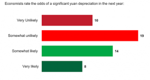
Following the mini-devaluation in August, the yuan appreciated in September and October. It began depreciating again in November and this has continued through the first half of December. The dollar finished the local session at new multi-year highs against the yuan. Many observers see in the pre-weekend announcement about monitoring the yuan against a basket an indication of the intentions of officials to push their currency down further against the dollar. We suggest that China...
Read More »Great Graphic: Euro Forecast by Global Banks
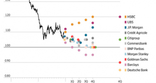
The dollar-euro is the most actively traded currency pair in the world. It is often what is meant when people ask where is the dollar trading. Dollar bullish sentiment prevailed in 2015, but many large banks doubt that it will continue in 2016. This Great Graphic from the Wall Street Journal shows the euro forecasts of eleven major banks. Indeed, it appears that only one of the eleven banks expect the euro to finish next year below parity ($1.00). Three banks, HSBC, UBS and JP...
Read More »Great Graphic: A Divergence that Gives China a Headache
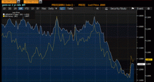
China was instructed by the IMF that as an operational requirement for joining the SDR that the gap between the onshore and offshore yuan (CNY and CNH respectively) needed to close. This was important for central banks to hedge. The opposite is taking place. That is what this Great Graphic, created on Bloomberg depicts. The yellow line is CNH. The white line is CNY. When PBOC facilitated a mini-devaluation in August, the spread widened out. However, in September and October, as it...
Read More »Great Graphic: Divergence is Still the Euro Driver
This remains one of my favorite Great Graphics that illustrate the divergence theme that I think is the main driver of the euro-dollar exchange rate. Composed on Bloomberg, it shows two time series. The first (white line) shows the German two-year yield minus the US two-year yield. It bottomed near -80 bp in mid-October and slid persistently through last Wednesday to hit reach almost -138 bp. The second time series (yellow line) shows the euro. It too peaked in mid-October near...
Read More »Great Graphic: Canadian Growth and Rate Expectations
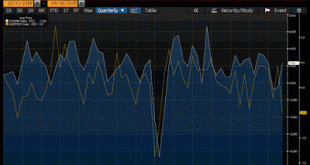
Canada reported its monthly GDP estimate for September, and at the same time, provided its first estimate of Q3 GDP. The Great Graphic, created on Bloomberg, shows both time series. The monthly GDP is depicted by the yellow line and the quarterly estimate is the white line. Clearly they track each other, as one would expected. The good news is that after contracting in the first two quarters of the year, the Canadian economy expanded by 2.3% in Q3. The bad news is that the growth...
Read More »Great Graphic: Decline of US Participation Rate Explained
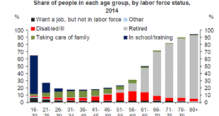
The decline in the labor force participation rate helps explain the substantial decline in the US unemployment rate over the past couple of years. That decline has helped bring the Federal Reserve to the point that a December rate hike is thought to be extremely likely barring a significant disappointment at the end of the week with the November jobs report. This Great Graphic was posted on Ritholtz's Big Picture Blog and was compiled by Deutsche Bank's Torsten Slok from BLS data. ...
Read More »Great Graphic: US 2-Year Premium over Japan and Germany
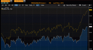
This Great Graphic was composed on Bloomberg. It shows two time series. The yellow line shows the premium the US pays over Germany for two-year money. The white line shows the premium the US pays over Japan for two-year money. The premiums have risen sharply since mid-October and today are at new multi-year highs. In the middle of October the US premium over Germany was near 80 bp. Today it was near 136 bp. Although the German 2-year yield has fallen below -40 bp, it is the US...
Read More »Great Graphic: Dollar Recoups January Loss Against the Swiss Franc
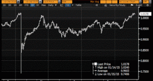
The US dollar recorded its high for the year against the Swiss franc on January 14 near CHF1.0240. It closed that day a little below CHF1.0190. The next day the Swiss National Bank surprised the world by lifting its cap against the euro. The dollar plunged to nearly CHF0.7400. It has taken increased prospects of a Fed rate hike, negative 75 bp on sight deposits at the SNB, and the prospect of more, if the European Central Bank takes additional unorthodox monetary measures in early...
Read More »Great Graphic: Canadian Dollar and the Two-Year Rate Differential
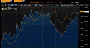
The Canadian dollar is more than a petro currency. It is also subject to the same forces of divergence that have lifted the US dollar more broadly. Since the beginning of the year, the US two-year yield has risen 26 bp while Canada's two-year yield has fallen almost 39 bp. This Great Graphic, created on Bloomberg shows two time series. The yellow line is the US dollar against the Canadian dollar. The white line is the two-year yield spread. Earlier today the US dollar tested the...
Read More » Swiss Economicblogs.org

