Pater Tenebrarum
My articles My siteAbout meMy booksMy videos
Follow on:TwitterFacebook
Seeking Alpha
SPX, Quo Vadis? Considering the Crash Potential In view of the fact that the stock market action has gotten a bit out of hand again this week, we are providing a brief update of charts we have discussed in these pages over the past few weeks (see e.g. “The Flight to Fantasy”). We are doing this mainly because the probability that a low probability event will actually happen has increased somewhat in recent days. Robert Taylor and Deborah Kerr cast wary glances at their ancient (modern at the time) pre-Ogygian deluge Quotron. This sucker is going down honey! - Click to enlarge This idea is mainly based on just a few technical data points. We concede these are not ”fully confirmed” at this stage, as a number of
Topics:
Pater Tenebrarum considers the following as important: Chart Update, Debt and the Fallacies of Paper Money, Featured, newslettersent, S&P 500 Large Cap Index, S&P 500 Large Cap Index, Stock markets, The Stock Market
This could be interesting, too:
Nachrichten Ticker - www.finanzen.ch writes Die Performance der Kryptowährungen in KW 9: Das hat sich bei Bitcoin, Ether & Co. getan
Nachrichten Ticker - www.finanzen.ch writes Wer verbirgt sich hinter der Ethereum-Technologie?
Marc Chandler writes March 2025 Monthly
Mark Thornton writes Is Amazon a Union-Busting Leviathan?
SPX, Quo Vadis? Considering the Crash PotentialIn view of the fact that the stock market action has gotten a bit out of hand again this week, we are providing a brief update of charts we have discussed in these pages over the past few weeks (see e.g. “The Flight to Fantasy”). We are doing this mainly because the probability that a low probability event will actually happen has increased somewhat in recent days. |
 Robert Taylor and Deborah Kerr cast wary glances at their ancient (modern at the time) pre-Ogygian deluge Quotron. This sucker is going down honey! - Click to enlarge |
| This idea is mainly based on just a few technical data points. We concede these are not ”fully confirmed” at this stage, as a number of normally expected inter-market warning signals remain by and large absent. Nevertheless pilgrims, we cannot ignore what looks like a potentially dire development – regardless of whether or not the stock market ends up bouncing today.
So here is an update of the comparison chart of three important benchmark indexes we posted earlier this week, including a few new annotations which take the most recent moves into account: |
S&P 500 Large Cap Index, NDX Daily and NYA Daily, Mar 2017 - 2018(see more posts on S&P 500 Large Cap Index, )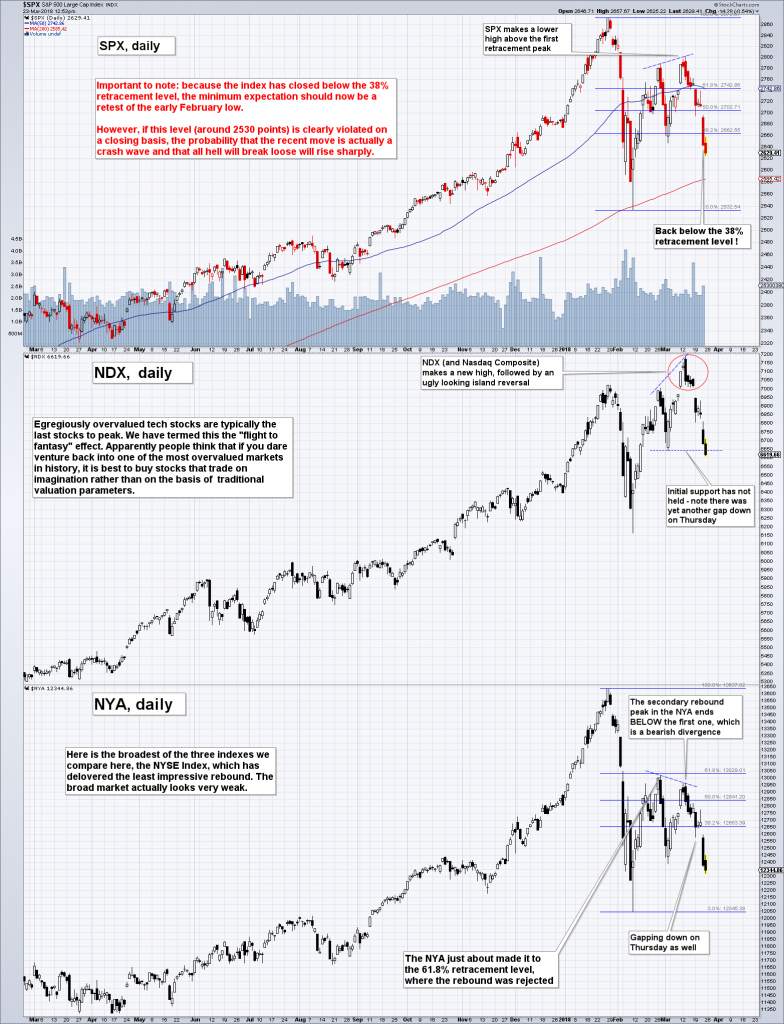 SPX, NDX and NYA – this looks ever more dangerous to us. - Click to enlarge The eerie similarities with several historical crash scenarios should not be dismissed lightly. That said, crashes are always low probability outcomes, so the default expectation should of course be that a retest is on its way. One has to be wary though. |
| The next chart is an update of the internals we have recently shown – particularly noteworthy, the new high/new low percentage index (HLP), which has just issued a new sell signal and is still far from “oversold”: |
S&P 500 New Highs-New Lows Percent, Dec 2014 - Mar 2018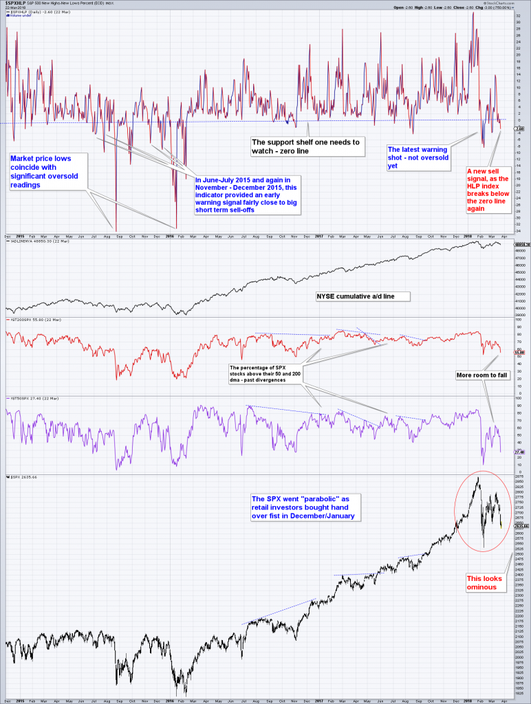 A new sell signal as the NH/NL percentage index (HLP) sinks below the zero line again. - Click to enlarge Nothing is sufficiently “oversold” yet. Note: there was no a/d line divergence at the peak, which we usually see at major turning points. However, such a divergence does not always happen – e.g. there was no a/d line divergence in 1937 either (along similar lines, margin debt peaked after rather than before the market top in that fateful year). |
| And finally, something we haven’t looked at in a very long time, the SPX monthly Coppock curve: |
SPX Coppock Curve, 1981 - 2018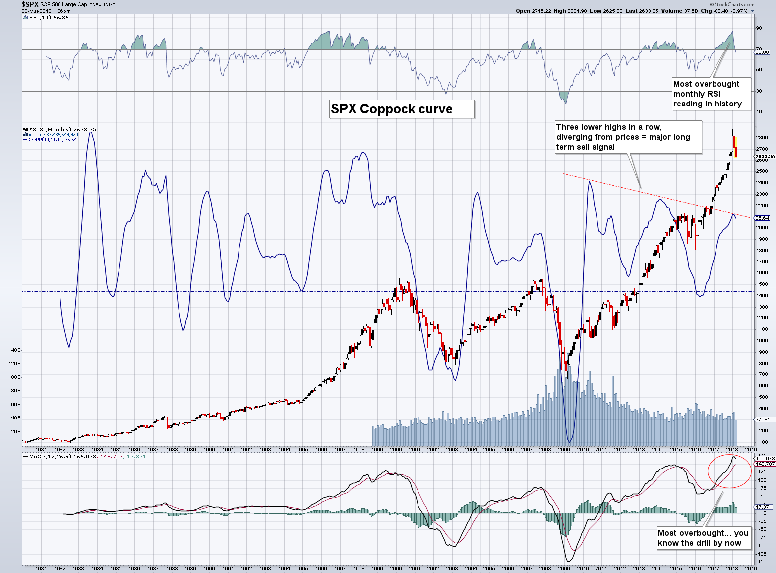 The monthly SPX Coppock curve gives a sell signal concurrent with the most overbought readings in monthly oscillators (RSI and MACD) in history. - Click to enlarge |
Conclusion – Don’t Rule Anything Out
We should perhaps also mention that the initial wave down in early February had five waves, and the rebound had three waves. In other words, these two waves look suspiciously like waves 1 and 2 of one higher degree, in which case the current decline would have to be labeled wave 3. Needless to say, that would be bad juju.
In short: yes, we know one should normally give more weight to the probability of a retest, but a more profound denouement simply cannot and should not be ruled out given the market’s overvaluation and the sharp decline in money supply growth since late 2016. Caution is definitely highly advisable at this juncture. On the other hand, a successful retest would of course represent an interesting short term trading opportunity as well.
Tags: Chart Update,Featured,newslettersent,S&P 500 Large Cap Index,The Stock Market