Summary:
That changes our perspective on the wonderfulness of ever-expanding household wealth. The assets of U.S. households recently topped 0 trillion, yet another sign that everything is going swimmingly in the U.S. economy. Let’s take a look at the Federal Reserve’s Household Balance Sheet, which lists the assets and liabilities of all U.S. households in very big buckets (real estate: trillion). (For reasons unknown, the Fed lumps non-profit assets and liabilities with households, but these modest sums are easily subtracted.) If we look at the numbers with a reasonably skeptical view, we start wondering about aspects that might have previously been taken as “facts” that were above questioning. For example,
Topics:
Charles Hugh Smith considers the following as important: 7) Markets, Featured, newsletter, Stock Market Bubble
This could be interesting, too:
Nachrichten Ticker - www.finanzen.ch writes Die Performance der Kryptowährungen in KW 9: Das hat sich bei Bitcoin, Ether & Co. getan
Nachrichten Ticker - www.finanzen.ch writes Wer verbirgt sich hinter der Ethereum-Technologie?
Martin Hartmann writes Eine Analyse nach den Lehren von Milton Friedman
Marc Chandler writes March 2025 Monthly
That changes our perspective on the wonderfulness of ever-expanding household wealth.
The assets of U.S. households recently topped $100 trillion, yet another sign that everything is going swimmingly in the U.S. economy. Let’s take a look at the Federal Reserve’s Household Balance Sheet, which lists the assets and liabilities of all U.S. households in very big buckets (real estate: $25 trillion). (For reasons unknown, the Fed lumps non-profit assets and liabilities with households, but these modest sums are easily subtracted.)
If we look at the numbers with a reasonably skeptical view, we start wondering about aspects that might have previously been taken as “facts” that were above questioning.
For example, households hold $11.6 trillion in cash (deposits). That’s unambiguous. So is the $29.3 trillion in stocks (owned directly and indirectly, i.e. retirement funds, etc.).
But what about the $16 trillion in “other financial assets”? This isn’t cash, stocks, bonds, retirement funds or noncorporate businesses–then what is it? Offshore banking?
That $16 trillion is equal to all homeowners’ equity (real estate minus mortgages). It’s a non-trivial chunk of the $100 trillion in net assets everyone is crowing about.
I also wonder about the valuation of noncorporate businesses–small family businesses, LLCs, sole proprietorships, etc.– $11.9 trillion. How do you value a business that’s hanging on by a thread? Or one that’s a tax shelter?
We know from other sources that roughly 85% of all this wealth is held by the top 10% of households. This isn’t included in this balance sheet, but without those statistics, these numbers lack critical context: if household wealth is soaring, that sounds wonderful. But what if 95% the gains are flowing to the top 5%, and within the top 5%, mostly to the top .1%?
That changes our perspective on the wonderfulness of ever-expanding household wealth.
IRS data from tax returns are one of the most reliable sources of financial data because there are stiff penalties for not filing accurate returns, and there are no “adjustments” or massaging of the statistics: they are what they are.
Here’s the primary page with numerous Excel spreadsheets for download: Individual Statistical Tables by Size of Adjusted Gross Income.
Adjusted Gross Income is reported on line 37 on Form 1040, income after major deductions such as moving expenses, self-employed health insurance, etc.
Each spreadsheet is a trove of information on wealth and income–distribution, inequality, sources of income, etc.
Consider Returns with Income or Loss from Sales of Capital Assets Reported on Form1040, Schedule D. This spreadsheet consolidates all tax returns that reported capital gains or losses.
|
Out of 150 million total individual tax returns, 11 million reported capital gains/losses, and 9.3 million were taxable returns.
1.26 million taxpayers reporting adjusted gross income of between $50,000 and $75,000 (middle-middle class) reported average capital gains of $6,187.
3 million taxpayers reporting adjusted gross income of between $100,000 and $200,000 (upper-middle class) reported average capital gains of $16,000.
250,000 taxpayers reporting adjusted gross income of $1 million or more reported average capital gains of $1,600,000.
So those earning 10 times a middle-class income of $100,000 reaped (on average) 100 times the middle class average of capital gains.
It’s worth noting that only 6% of tax returns reported taxable capital gains, and of these 9 million returns, the lion’s share of the capital gains flowed to the top 0.0016% of all returns–the 250,000 reporting incomes of $1 million and higher.
If we want to understand wealth and income inequality, we can start with the data point that 63% of all capital gains flows to the top (those earning $1 million and up).
|
US Stock Market Bubble(see more posts on Stock Market Bubble, )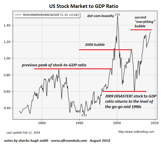 - Click to enlarge |
Tags: Featured,newsletter,Stock Market Bubble