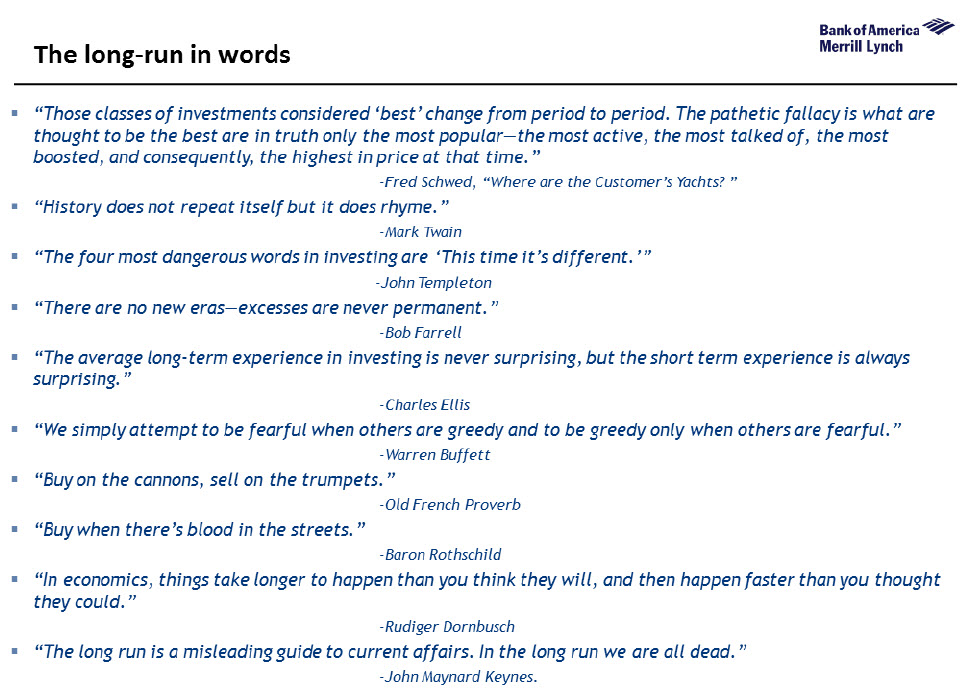
In the long run, as someone once said, we are all dead, but in the meantime, as BofAML’s Michael Hartnett provides a stunning tour de force of the last 5000 years illustrates long-run trends in the return, volatility, valuation & ownership of financial assets, interest rates & bond yields, economic growth, inflation & debt… The Longest Pictures reveals the astonishing history investors are living through today: lowest interest rates in 5000 years; lowest UK base rate since 1705; a negative Japanese bond yield for the 1st time since 1870; all-time highs in corporate bond returns; slowest Chinese nominal growth in over 20 years; US stocks at 60-year highs vs Europe; bank stocks at 75-year relative lows; largest losses from commodities since 1933. On Dec 16th the Fed raised rates for the 1st time in almost a decade, ending the longest run of unchanged policy since Fed founded in 1913. The Longest Pictures illustrates how unprecedented monetary stimulus in recent years has failed to deliver recovery, how the global “War on Deflation” has been retarded by excess Debt, aging Demographics, technological Disruption, and why the current Fed hiking cycle could be “one & done”. Electorates are increasingly voting for policies to address wage deflation, immigration & inequality.
Topics:
Tyler Durden considers the following as important: Australia, Bond, Brazil, Central Banks, China, CPI, Debt and the Fallacies of Paper Money, Demographics, Eurozone, Featured, Iceland, inflation assets, Investment Grade, Japan, Lehman, Main Street, Monetary Policy, New Zealand, newsletter, Norway, Recession, recovery, Switzerland, Unemployment, Volatility
This could be interesting, too:
Nachrichten Ticker - www.finanzen.ch writes Die Performance der Kryptowährungen in KW 9: Das hat sich bei Bitcoin, Ether & Co. getan
Nachrichten Ticker - www.finanzen.ch writes Wer verbirgt sich hinter der Ethereum-Technologie?
Martin Hartmann writes Eine Analyse nach den Lehren von Milton Friedman
Marc Chandler writes March 2025 Monthly
In the long run, as someone once said, we are all dead, but in the meantime, as BofAML’s Michael Hartnett provides a stunning tour de force of the last 5000 years illustrates long-run trends in the return, volatility, valuation & ownership of financial assets, interest rates & bond yields, economic growth, inflation & debt…
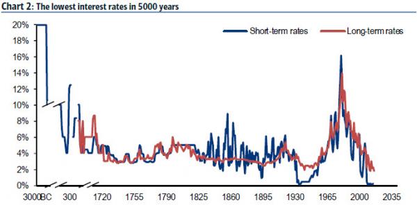
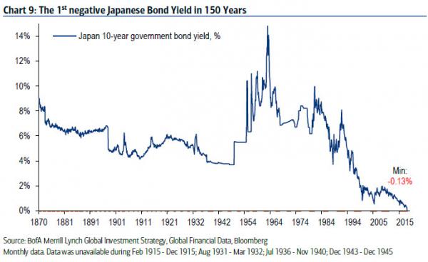
The Longest Pictures reveals the astonishing history investors are living through today: lowest interest rates in 5000 years; lowest UK base rate since 1705; a negative Japanese bond yield for the 1st time since 1870; all-time highs in corporate bond returns; slowest Chinese nominal growth in over 20 years; US stocks at 60-year highs vs Europe; bank stocks at 75-year relative lows; largest losses from commodities since 1933.
On Dec 16th the Fed raised rates for the 1st time in almost a decade, ending the longest run of unchanged policy since Fed founded in 1913. The Longest Pictures illustrates how unprecedented monetary stimulus in recent years has failed to deliver recovery, how the global “War on Deflation” has been retarded by excess Debt, aging Demographics, technological Disruption, and why the current Fed hiking cycle could be “one & done”.
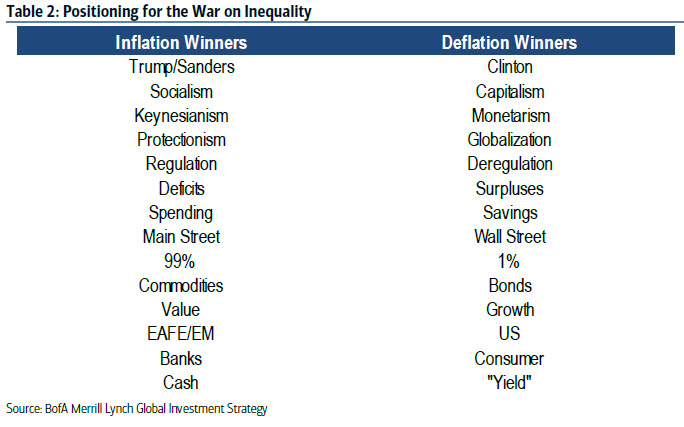
Electorates are increasingly voting for policies to address wage deflation, immigration & inequality. The great investment question of our time: will coming “War on Inequality” (via taxation, protectionism, helicopter money) mark secular inflection point for inflation & bond yields (last one was 1981)? Regime change required first, but secular contrarians would be long “inflation assets” (commodities, TIPS, EAFE/EM, banks, value, cash, active) & short “deflation assets” (bonds, IG, US, consumer, growth, “yield”, passive).
The Longest Picture…
|
…interest rates are at their lowest level in 5000 years. Why? | |
|
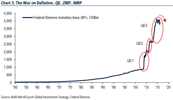
Since the Global Financial Crisis the “War on Deflation” has been fought exclusively with monetary policy… …654 rate cuts since Lehman bankruptcy | |
|
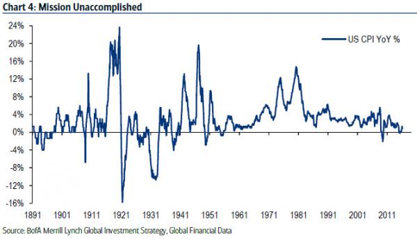
Yet global economic growth remains anemic by historic standards. And 8 years after the “War on Deflation” was launched, inflation rates are extremely low… US CPI = 1.1% | |
|
Debt & Deleveraging thwart the War on Deflation. Debt levels remain high, as high as they have ever been in peacetime for the US government. Banks continue to deleverage. Savings thus encouraged, borrowing discouraged, and “animal spirits” of household & corporate sectors repressed. Note that even the highly profitable US corporate sector currently has record cash on balance sheet of $1.7tn (equal to the GDP of Texas or Brazil). | |
|
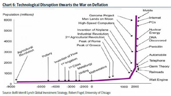
Disruption thwarts the War on Deflation. Tech disruption is deflationary. The “Amazonification” of the retail industry exerts downward pressure on prices. The acceleration of robots & AI (the number of global robots is forecast to rise from 1 million in 2010 to 2.5 million in 2020) exerts downward pressure on wage expectations. The increase in life expectancy via biotech & genomics puts upward pressure on saving for a longer retirement and higher health care costs. | |
|
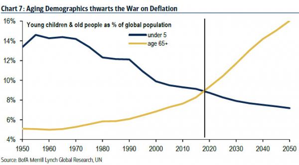
Demographics thwarts the War on Deflation. In the next 10 days 112,000 people will reach retirement age in the US, Europe & Japan). A world of zero rates is making saving for retirement extremely tough. And by 2020 (Chart) the world will experience “peak youth”…for the first time in human history with the number of persons aged 65+ expected to outnumber children under-5 by the end of this decade. | |
|
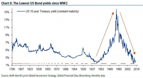
Today’s “deflationary expansion” means the greatest bull market in bonds rages on. From an all-time peak of 15.8% in Sep’80, the US 10-year Treasury yield fell to 1.45% in 2012, the lowest since 1945. In the past 4 years bond yields have remained stubbornly low in the US… | |
|
…while government bond yields in Japan, Eurozone & Switzerland have, in the past year, all fallen into negative territory for the first time ever. The cocktail of QE, ZIRP & NIRP has been a potent one for Wall Street & the price of financial assets in the past 8 years… …especially intoxicating for financial assets that offer “yield”, “quality” & “growth”, scarce assets in a world of low economic growth & interest rates… | |
|
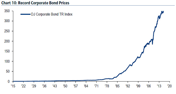
…returns from US Investment Grade bonds hit an all-time high in recent weeks… | |
|
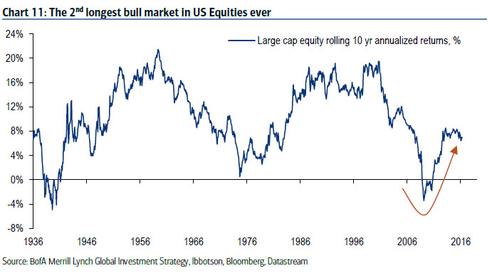
…and on April 28th, 2016, the bull market in US stocks became the 2nd longest of all-time. | |
|
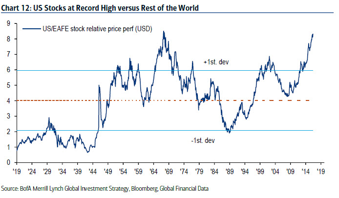
The chart shows how the 10-year rolling return from stocks in Feb’09 fell to its lowest level since Aug’39 during the GFC, a good reminder that investors should always buy “humiliation”. The global “deflationary expansion” has been very positive for US assets relative to RoW… …US is the Great Disruptor, US population aging less quickly that in Europe, Japan & China, and US potential real GDP growth still close to 2%… …US stocks are close to all-time price relative highs vs EAFE index (Chart) and already at 60-year highs vs European stocks. | |
|
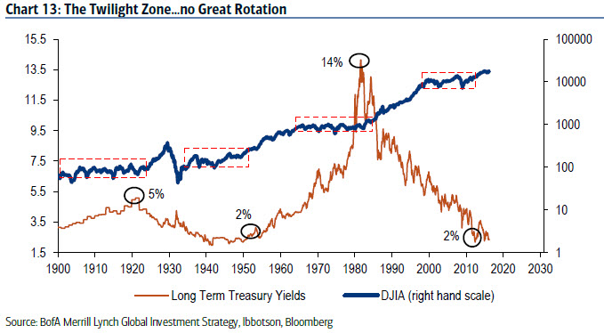
And yet the bull market has waned in the past 18 months, there has been no “normalization” of growth, rates & asset allocation, no “Great Rotation”, and bonds & stocks have been trapped in a Twilight Zone of volatile trading ranges… Driven by: | |
|
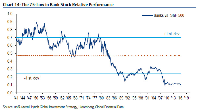
Bank stocks (the chart shows the relative performance of US banks close to a 75-year low) are indicative of world stuck in a minimum growth, minimum rate backdrop. (Indeed, the chart of relative bank performance could easily be mistaken for a chart of interest rates). | |
|
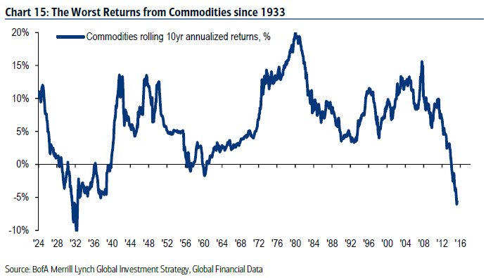
The collapse in the rolling return from commodities to the lowest level since 1939 similarly indicative of asset class that has been a “deflation loser”. Commodities, banks, value stocks, TIPS, cash… are today’s humiliated asset classes, the new secular contrarian “longs”. But the secular case for these “deflation losers” requires a catalyst (it was QE for stocks in 2009). | |
|
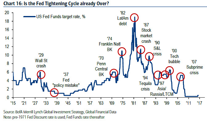
On Dec 16th last year Fed hiked rates for 1st time in a decade, ending longest run of unchanged policy since Fed founded in 1913. The chart shows Fed tightening cycles end with “events”. Recent history (Japan, Sweden, Euro area, New Zealand, Australia, Norway, Iceland) shows how monetary tightening attempts have been quickly punished, aborted & reversed in a deflationary backdrop. Note asset prices respond very well to “one & done” Fed hiking cycles (there have been 7 since 1926). | |
|
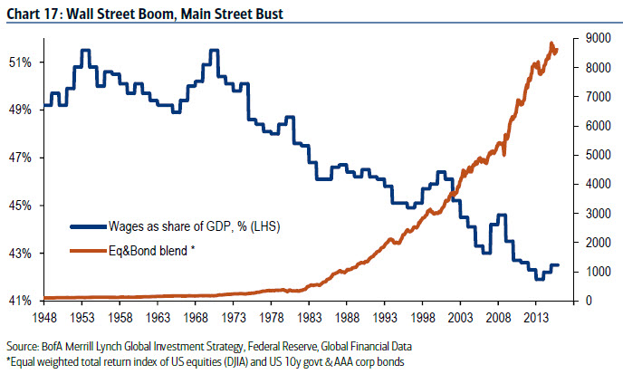
But The Longest Pictures shows that monetary policy has failed to deliver the knockout blow to Deflation. Wall Street has boomed; but Main Street has not (wages continue to fall as % GDP). Unsurprisingly electorates are increasingly voting for policies to address wage deflation, unemployment, immigration and inequality. Income inequality is clearly unlikely to be solved via a further sustained rise in asset prices. | |
|
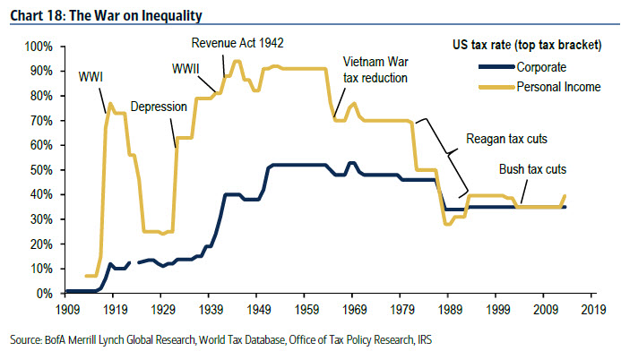
Investors must thus start to discount a “War on Inequality” via: 1. Regressive Taxation: tax rates, most particularly for the highest tax brackets, are likely to increase in coming years. | |
|
The great question for investors coming years: will the coming “War on Inequality” mark a historic inflection point for inflation and bond yields? (Last great inflection point was 1981). Some policies (helicopters) more likely to induce inflation expectations than others (protectionism & regressive taxation). |
Regime change required first, but the secular contrarian positioning for the War on Inequality should be long “inflation assets” (commodities, TIPS, EAFE/EM, banks, value, active, cash) & short “deflation assets” (bonds, IG, US, consumer, growth, “yield”, and passive managers).
Source: BofAML
Previous post
