Wednesday , May 1 2024
Home / Tag Archives: Correlations

Tag Archives: Correlations

Great Graphic: Two-year Rate Differentials

Given that some of the retail sales that were expected in June were actually booked in May is unlikely to lead to a large revision of expectations for Q2 US GDP, the first estimate of which is due in 11 days. Before the data, the Atlanta Fed’s GDP Now projects the world’s biggest economy expanded at an annualized pace of 3.9% in Q2. If true, it would be the strongest quarterly expansion since Q3 14, when the economy...
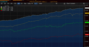
Read More »

Great Graphic: US 2-year Yield Rises Above Australia for First Time since 2000

Summary: The US and Australian two-year interest rates have diverged. There is scope for a further widening of the spread. Directionally the correlation between the exchange rate and the rate differentials is strong, but not stable. Near-term technicals are supportive but the move above trendline resistance is needed to confirm. The steady increase in the US two-year yield while the market unwinds rate hike...

Read More »

Great Graphic: US Curve and the Euro

This Great Graphic was created on Bloomberg. It shows two times series. The yellow line and the left-hand scale show the euro’s exchange rate against the dollar for the past year.  The white line depicts the spread between the US two-year and 10-year yield. I show the curve this way to be more intuitive with the euro rather than the 10-2 yr curve. To be clear as the curve has flattened the white line rises.   Despite me...

Read More »

Great Graphic: US Rate Curve and the Euro

This Great Graphic was created on Bloomberg. It shows two times series. The yellow line and the left-hand scale show the euro’s exchange rate against the dollar for the past year.  The white line depicts the spread between the US two-year and 10-year yield. I show the curve this way to be more intuitive with the euro rather than the 10-2 yr curve. To be clear as the curve has flattened the white line rises.   Despite me...

Read More »

Great Graphic: OIl and the S&P 500

The first Great Graphic (created on Bloomberg) here shows the rolling 60-day correlation of the level of the S&P and the level of oil since the beginning of last year. In early 2016, the correlation was almost perfect, but steadily fell and spend a good part of the second half of the year negatively correlated. Late in the year, the correlation began recovering, and February reached almost 0.8. However, a month...

Read More »

Are Interest Rates No Longer Driving the Dollar?

Summary: Many are concerned that the dollar and interest rates have become decoupled. We are not convinced. Correlations, not to be eyeballed, are still robust. The US 10-year yield is at its highs for the year, and yet the US dollar has been struggling to gain traction.Some suggest that this means that the dollar rally is over.  Charts like this one are circulating among market participants. This  Great...

Read More »

Great Graphic: Beware of Sophistry about the Yen and Nikkei

There is a common ploy used by many analysts and reporters that often simply does not stand up to close scrutiny, and would in fact be mocked in the university.   The ploy is to take two time series and put them on the same chart but use different scales. Such a ploy often is used to demonstrate a closer relationship between the two variables than is actually the case.  A current example is a chart of the dollar-yen rate and Japanese stocks. Here is a Great Graphic that was in the...

Read More »