Summary:
Hello reverse wealth effect. There’s a place for fancy technical interpretations, but sometimes a basic chart tells us quite a lot. Here is a basic chart of the Dow Jones Industrial Average, the DJIA. It displays basic information: price candlesticks, volume, the 50-week and 200-week moving averages, RSI (relative strength), MACD (moving average convergence-divergence), stochastics and the MACD histogram. These kinds of charts are free (in this case, from StockCharts.com). Dow Jones Industrial Average Index, Nov 2015 - Feb 2018 - Click to enlarge This is an ugly chart.It’s ugly because the decline to date is still far above support levels (the 50-week and 200-week moving averages) and the indicators have only
Topics:
Charles Hugh Smith considers the following as important: Featured, newsletter, The United States
This could be interesting, too:
Nachrichten Ticker - www.finanzen.ch writes Die Performance der Kryptowährungen in KW 9: Das hat sich bei Bitcoin, Ether & Co. getan
Nachrichten Ticker - www.finanzen.ch writes Wer verbirgt sich hinter der Ethereum-Technologie?
Martin Hartmann writes Eine Analyse nach den Lehren von Milton Friedman
Marc Chandler writes March 2025 Monthly
|
Hello reverse wealth effect.
There’s a place for fancy technical interpretations, but sometimes a basic chart tells us quite a lot. Here is a basic chart of the Dow Jones Industrial Average, the DJIA. It displays basic information: price candlesticks, volume, the 50-week and 200-week moving averages, RSI (relative strength), MACD (moving average convergence-divergence), stochastics and the MACD histogram. These kinds of charts are free (in this case, from StockCharts.com).
|
Dow Jones Industrial Average Index, Nov 2015 - Feb 2018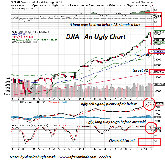 - Click to enlarge |
This is an ugly chart.It’s ugly because the decline to date is still far above support levels (the 50-week and 200-week moving averages) and the indicators have only just started registering sell signals. This means that price will have to decline a lot more to test previous support and send the indicators to levels that signal reasonably low-risk entries.
In other words, there’s nothing suggesting this is a buying opportunity in this chart. Rather, it suggests a decline of another couple thousand points would be perfectly normal in a weekly chart with a big fat MACD sell cross and sinking RSI and stochastics.
Even a decline of 6,000 points to 18,900 would be technically very typical of an over-stretched asset snapping back to long-term support.
Buying the dip is a good way to experience churning whipsaws. Up 350 points, then down 450. Nice if you can second-guess the trading bots, not so nice if you assume every dip should be bought because the market always rallies from every dip. Maybe, maybe not.
Something changed, and no, it isn’t just the easy-money sell-volatility trade blew up. All the other easy-money sure-thing momentum plays are now in doubt: the buy the FAANG stocks sure-thing, the buy the DJIA sure-thing, the buy the New Nifty 50 (Boeing et al.) sure-thing, the buy emerging bonds, stocks and and FX sure-thing, the buy bonds because interest rates will continue drifting lower forever sure-thing, the buy utilities sure-thing (the 15% drop since December 1 put a dent in that sure-thing), the buy REITs sure-thing, and so on.
If the momo trends that enabled every trading bot to make money by buying the dip and selling volatility go away, how will everyone make money? The short answer is that it suddenly becomes much more difficult to make money and keep it.
God forbid that money managers and punters would have to actually do their homework and pick stocks based on fundamentals. And what happens when those fundamentals start deteriorating as “growth” slides into “stagnation”?
Hello reverse wealth effect. As everyone feels poorer (because their phantom “wealth” evaporated), then they’re less inclined to borrow and blow tons of money that’s not actually theirs.
In the meantime, check out the cool correlation of bat guano, the yen pushed forward 6 months, lumber futures, the Big Mac Index, and the LIBOR/bitcoin pair… the quatloo is a screaming buy.
Tags: Featured,newsletter