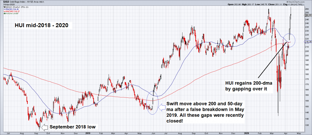
Gold Sector Outperforms Broad Market The gold sector is in an uptrend since September 2018. The initially rather labored move accelerated after a secondary low was established in May 2019 and the 50-day and 200-day moving averages were breached for the second time. Last week the two moving averages were once again overcome in the course of the post-crash rebound. Here is a chart showing the entire move since 2018: HUI mid-2018-2020After a rather harrowing decline in sympathy with the February-March stock market crash, the HUI has swiftly moved back to its previous high for the move and is now trading above its 50- and 200-day moving averages again. - Click to enlarge Since the September 2018 low, the gold sector is outperforming the broad market. As the
Topics:
Pater Tenebrarum considers the following as important: 6b.) Acting Man, 6b) Austrian Economics, 7) Markets, Chart Update, Featured, newsletter, Precious Metals, The Stock Market
This could be interesting, too:
Nachrichten Ticker - www.finanzen.ch writes Die Performance der Kryptowährungen in KW 9: Das hat sich bei Bitcoin, Ether & Co. getan
Nachrichten Ticker - www.finanzen.ch writes Wer verbirgt sich hinter der Ethereum-Technologie?
Martin Hartmann writes Eine Analyse nach den Lehren von Milton Friedman
Marc Chandler writes March 2025 Monthly
Gold Sector Outperforms Broad MarketThe gold sector is in an uptrend since September 2018. The initially rather labored move accelerated after a secondary low was established in May 2019 and the 50-day and 200-day moving averages were breached for the second time. Last week the two moving averages were once again overcome in the course of the post-crash rebound. Here is a chart showing the entire move since 2018: |
HUI mid-2018-2020 |
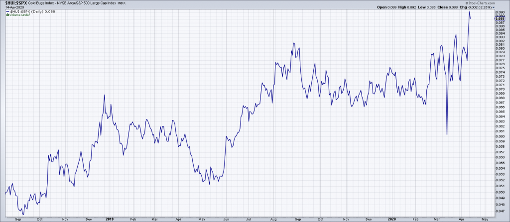
| Since the September 2018 low, the gold sector is outperforming the broad market. As the HUI-SPX ratio shows, its outperformance has recently accelerated: |
HUI-SPX ratio |
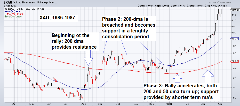
The Importance of Moving AveragesBack in 2015 we showed a number of charts illustrating the importance of the 200-day moving average. History certainly suggests it is a demarcation one should pay close attention to. A chronological review of these charts follows below: 1986 The 1986 low in the XAU Index: once the 200-day moving average was overcome, it was tested from above and began to serve as support. The rally then accelerated after the 50-day ma was bested as well. |
XAU, 1986-1987 |
| 1992
In 1992 the 200-dma once again provided support after it was breached from below. The sequence was very similar to the 1986 low. |
XAU Gold & Silver Index, 1992-1993 |
| 1998
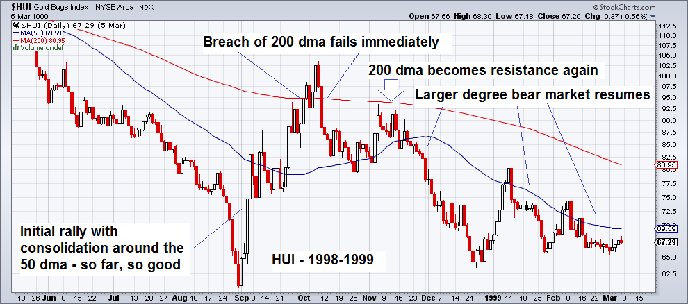
The 1998 example shows what happens when a breach of the 200-dma fails immediately: the 200- and 50-day moving averages subsequently remain resistance. |
HUI Gold Bugs Index, 1998-1999 |
| 2000
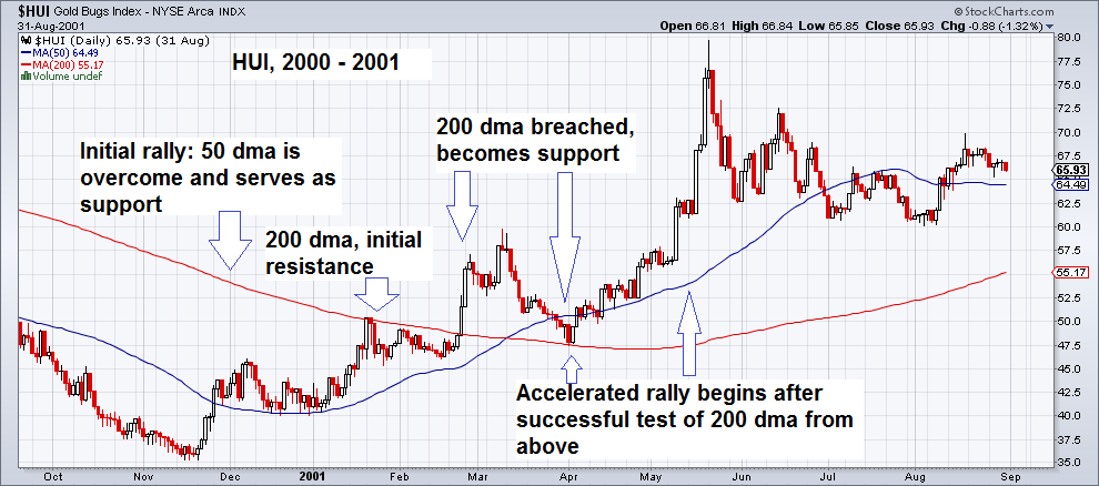
The memorable low of November 2000: in this case the HUI index also consolidated above the 200-dma after breaching it from below. It was then also retested from above, just before the advance accelerated. |
HUI Gold Bugs Index, 2000-2001 |
| 2008
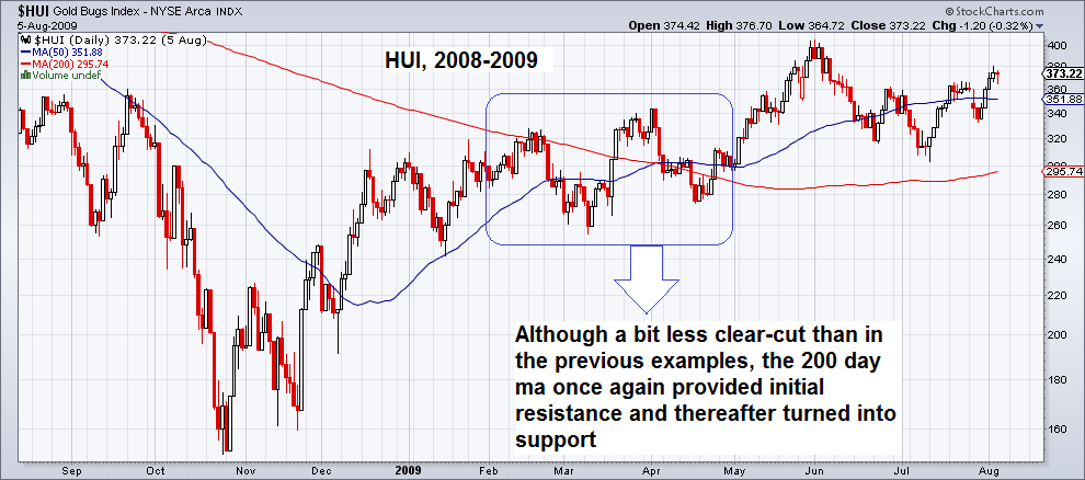
After the GFC low in 2008, the 200-dma once again initially offered resistance and turned into support after it was overcome. The backing and filling at the time was a bit more “muddy”, as small breaks of the 50- and 200-dma occurred on several occasions, but these were quickly reversed. |
HUI Gold Bugs Index, 2008-09 |
| 2016
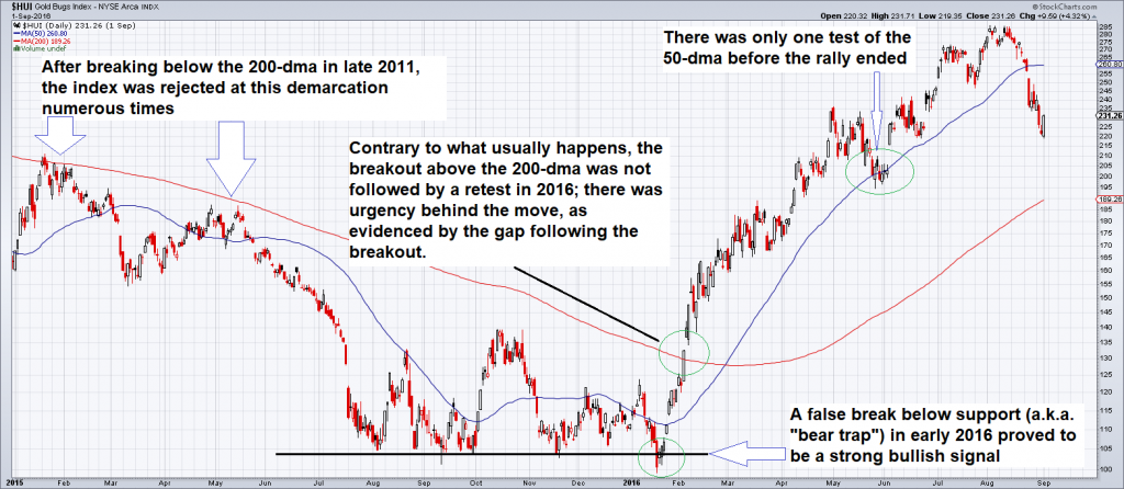
This time we can show the 2016 example as well- which is actually a bit of a special case, as there was no consolidation whatsoever after the index jumped over the 200-dma. In the course of the entire rally there was a single test of the 50-dma, and that was it. The rally peaked in August 2016, with the index having delivered a scorching 180% return (the XAU was actually a bit stronger – it rose by 200%). Before the index bottomed in 2015-2016, rallies were frequently rejected at the 200-dma. |
HUI Gold Bugs Index, 2016 |
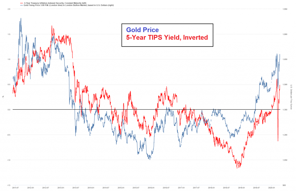
ConclusionFirst of all, the relative strength of the gold sector against the broad market in the recent post-crash rebound is an unalloyed positive. It is usually always a good idea to be engaged in strong sectors – odds are they will remain strong. It should also be noted that leading big cap stocks within the gold sector such as NEM and GOLD have already broken out to new highs and are already trading above their pre-crash levels. Secondly, following the recent breach of the 200-dma one should watch closely what happens if/when the HUI index consolidates its gains. Ideally it should not decline below the 200-dma on a retest – the moving average should become support from here on out. A failure to hold on a retest would constitute a warning sign. Addendum: Gold and Real Interest RatesHere is a chart that shows the gold price against an inverted plot of the 5-year TIPS yield (our proxy for real interest rates). We have inverted the TIPS yield so as to show the normally inverse correlation as a positive correlation: Most of the time gold prices tend to slightly lead real interest rates: on this chart the territory above the black “zero-bound” line represents negative real rates, the territory below it positive real rates. The negative correlation between real interest rates and the gold price continues to be quite pronounced. |
Gold Price, 5-Year TIPS Yield, Inverted |
One should always keep an eye on this chart – strong divergences tend to be a heads-up that either a rally or decline in the gold price is imminent. Minor divergences are usually not a problem given the above mentioned lead-lag relationship. Significant divergences were evident in 2011-2012, late 2015 and mid to late 2018, which were major turning points for both gold and real interest rates.
Tags: Chart Update,Featured,newsletter,Precious Metals,The Stock Market

