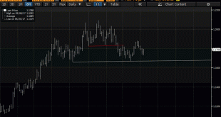
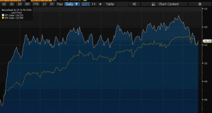
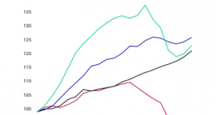
Summary Euro looks like it is carving out a top. The importance also lies in identifying levels that the bearish view may be wrong. Widening rate differentials, a likely later peak in divergence than previously anticipated, and one-sided market positioning lend support to the bearish view. This Great Graphic depicts the top the euro is carving. We suggest that several fundamental developments lie behind the...
Read More »Great Graphic: Potential Head and Shoulders Bottom in the Dollar Index
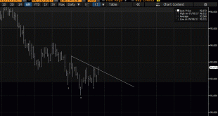
This Great Graphic was composed on Bloomberg. It shows the recent price action of the Dollar Index. There seems to be a head and shoulders bottoming pattern that has been traced out over the last few weeks. The right shoulder was carved last week, and today, the Dollar Index is pushing through the neckline, which is found by connecting the bounces after the shoulders were formed. One of the important contributions of...
Read More »Great Graphic: Young American Adults Living at Home
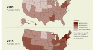
This Great Graphic caught our eye (h/t to Gregor Samsa @macromon). It comes from the US Census Department, and shows, by state, the percentage of young American adults (18-34 year-olds). The top map is a snap shot of from 2005. A little more than a quarter of this cohort lived at home. A decade later, and on the other side of the Great Financial Crisis, the percentage has risen to a little more than a third. The deeper...
Read More »Great Graphic: Home Ownership and Measuring Inflation
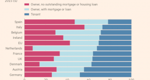
Summary Home ownership varies throughout the EU but is overall near US levels. Germany has the lowest home ownership, and Spain has the most. Italy has the least amount of mortgages. US include owner equivalent rents in CPI, the EU does not. This Great Graphic was in the Financial Times recently. It shows home ownership rates several EU countries. The useful chart also shows those who own (red bar) and those...
Read More »Great Graphic: Small Caps and the Trump Trade
The Russell 2000, which tracks the 2000 smallest companies in the Russell 3000, is threatening to turn positive for the year. It had turned negative in the second half of last week. Many pundits saw its decline and the penetration of the 200-day moving average for the first time in over a year as a sign of an impending down move in the broader equity market. Given valuation, and the number of big name asset managers and...
Read More »How will Yellen Address Fostering a Dynamic Global Economy?
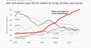
Summary Yellen has identified two challenges regarding the US labor market, the opioid epidemic and women participation in the labor force. The topic of the Jackson Hole gathering lends itself more to a discussion of these issues than the nuances of monetary policy. Dynamic world growth needs a dynamic US economy, and that requires more serious thinking about these socio-economic and political issues. The topic at...
Read More »Euro Flirting with Near-Term Downtrend
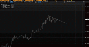
Summary: North American traders began the week by selling dollars. Euro is testing a downtrend off the year’s high. DXY is testing its uptrend. After consolidating in the Asian session and European morning, the euro has been bid higher in North America. It is testing a downtrend line, drawn off the year’s high set in early August near $1.1910, as depicted in this Great Graphic, composed on Bloomberg. It is met the...
Read More »Great Graphic: Unemployment by Education Level
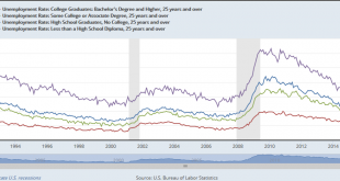
The US reports the monthly jobs data tomorrow. The unemployment rate stood at 4.4% in June, after finishing last year at 4.7%. At the end of 2015 was 5.0%. Some economists expect the unemployment rate to have slipped to 4.3% in July. Recall that this measure (U-3) of unemployment counts those who do not have a job but are looking for one. There are several other measures, and which one is right depends on what question...
Read More »Great Graphic: Italy-It is Not Just about Legacy
A little while back I was part of a small exchange of views on twitter. It was about Italy. I was arguing against a claim that Italy’s woes are all about its past fiscal excesses. It is not just about about Italy’s legacy. It is true that Italy runs a primary budget surplus. The primary budget surplus has averaged in excess of 2% for nearly two decades. Over this period, Italy debt has soared. I took exception with a...
Read More »Great Graphic: CRB Index Hits 2017 Down Trendline
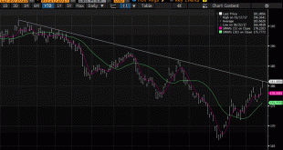
The CRB Index gapped higher today and it follows a gap higher opening on Tuesday, which has not been filled. Today’s gains lift the commodity index to a trendline drawn off the January and February highs and catches the high from late May. It intersects today near 181.35 and the high has been a little over 181.17. This is depicted on the Great Graphic made on Bloomberg, with five and 20-day moving averages added....
Read More » Swiss Economicblogs.org

