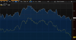
Summary: Swiss franc weakness is a function of the demand for euros. SNB indicates it will lag behind the other major central banks in normalization process. Easing of political anxiety in Europe is also negative for the franc. The Swiss franc is trading at its lowest level against the euro since the Swiss National Bank surprised the world by lifting the currency cap in early 2015. This week’s move has been...
Read More »Great Graphic: Surprise-S&P 500 Outperforming the Dow Jones Stoxx 600
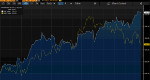
Many asset managers have been bullish European shares this year. European and emerging market equities are among the favorite plays this year. Surveys of fund managers find that the allocation to US equities is among the lowest in nearly a decade. The case against the US is based on overvaluation and being a crowded trade. Many are concerned about too hawkish of a Federal Reserve (policy mistake) or the lack of tax...
Read More »Great Graphic: Dollar Index Bottoming?
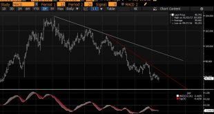
Summary Downside momentum is fading and technicals are showing a bullish divergence. The Dollar Index has not met the minimum corrective retracement target, meaning that it is premature to talk about bear market. We identify two pre-conditions to enter trade. The Dollar Index set the year’s high on January 3 a little above 103.20. Today it made a marginal new lows for the year at 95.464. The previous low, set at...
Read More »Great Graphic: Sticky Pass Through
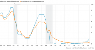
This Great Graphic was posted by Steve Goldstein at MarketWatch. The blue line shows the effective Fed funds rate. The orange line depicts the average interest rate on a $10,000 one-year CD. The Fed funds target rate has risen, but the rate of the average yield of the certificate of deposit has not risen. It is at 25 bp, an increase of five basis points over the past four years. Goldstein documents other evidence that...
Read More »Great Graphic: Don’t be Misled by Sterling Stability, Investors are Concerned
The Great Graphic, created on Bloomberg, shows the options skew (three-month 25 delta risk reversal) in the white line, and sterling is the yellow line. The takeaway is that the market appears to be more nervous than the relatively firm sterling in the spot market suggests. Typically, one might expect those with sterling exposure to sell calls (and receive funds) rather than buy puts (new expenditure). The buyers...
Read More »Great Graphic: Iron Ore and the Australian Dollar
This Great Graphic, from Bloomberg, shows the correlation between the price of iron ore and the Australian dollar on a rolling 60-day basis over the past year. The correlation is a little more than 0.81. The relationship is the tightest since last August. This is purely directional. The correlation weakens considerably if we look at returns. When conducted on the basis of percentage change, the correlation drops to a...
Read More »Great Graphic: US Curve and the Euro
This Great Graphic was created on Bloomberg. It shows two times series. The yellow line and the left-hand scale show the euro’s exchange rate against the dollar for the past year. The white line depicts the spread between the US two-year and 10-year yield. I show the curve this way to be more intuitive with the euro rather than the 10-2 yr curve. To be clear as the curve has flattened the white line rises. Despite me...
Read More »Great Graphic: US Rate Curve and the Euro
This Great Graphic was created on Bloomberg. It shows two times series. The yellow line and the left-hand scale show the euro’s exchange rate against the dollar for the past year. The white line depicts the spread between the US two-year and 10-year yield. I show the curve this way to be more intuitive with the euro rather than the 10-2 yr curve. To be clear as the curve has flattened the white line rises. Despite me...
Read More »Great Graphic: OIl and the S&P 500
The first Great Graphic (created on Bloomberg) here shows the rolling 60-day correlation of the level of the S&P and the level of oil since the beginning of last year. In early 2016, the correlation was almost perfect, but steadily fell and spend a good part of the second half of the year negatively correlated. Late in the year, the correlation began recovering, and February reached almost 0.8. However, a month...
Read More »Great Graphic: Trade-Weighted Dollar
Summary: US TWI has appreciated a little since the end of Q1. The euro and sterling’s strength are exceptions to the rule. The dollar has edged up against the currencies of the US top four trading partners here in Q2. In early Asia today, the euro reached its highest level against the dollar since the US election last November. Sterling was near seven-month highs. It is primarily because of the strength of...
Read More » Swiss Economicblogs.org

