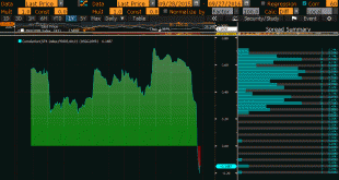
Summary: The relationship between the change in Us 10-year yields and the change in the S&P 500 has broken down. The 60-day correlation is negative for the first time since late Q2 2015. It is only the third such period of inverse correlation since the start of 2015. As market participants, we are sensitive to changing inter-market relationships. This Great Graphic, from Bloomberg shows the correlation...
Read More »Great Graphic: Nearly Five-Month Uptrend in the Dollar Index Set to be Tested
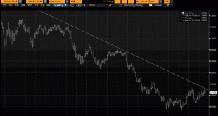
The US Dollar Index has been trending higher since early May. This Great Graphic, created on Bloomberg shows, that it has been successfully tested several times. It appears set to be re-tested in the coming days. It comes in near 94.80 today and rises a little more than two ticks a day to finish the week near 94.90. Technical indicators, like the RSI, MACDs, and Slow Stochastics suggest there is reasonably good...
Read More »Great Graphic: Median U.S. Income per Presidents
[unable to retrieve full-text content]Median household income was higher in 2015 than in 2008, but still below 1999 peak in real terms. The bottom fifth of households by income have just recouped what was lost. Income growth did best under (Bill) Clinton and Reagan, including for top 5%. Origin of strong dollar policy means it will not be used as a trade weapon and it hasn't since Bentsen.
Read More »Great Graphic: Net Mexican Migration to the US–Not What You Might Think
Summary: Net migration of Mexicans into the US has fallen for a decade. The surge in Mexican migration into the US followed on the heels of NAFTA. Although Trump has bounced in the polls, and some see this as negative for the peso, rising US interest rates and the slide in oil price are more important drivers. There has been much discussion in the US presidential campaign about immigration, especially from...
Read More »Great Graphic: What Kind of Jobs is the US Creating
[unable to retrieve full-text content]The oft repeated generalization about the dominance of low paying jobs is not true for the last few years. This does note refute the disparity of wealth and income in the US. There is a restructuring taking place that favors educated and skilled workers.
Read More »Great Graphic: Aussie Tests Three-Year Downtrend
Summary: The Australian dollar’s technical condition has soured. Market sentiment may be changing as the MSCI World Index of developed equities posted a key reversal yesterday. It is not clear yet whether the Aussie is correcting lower or whether there has been a trend change. Since late July, I have been looking for the Australian dollar to turn lower. Instead, the Aussie has continued to climb. It has risen...
Read More »Great Graphic: Dollar-Yen–Possible Head and Shoulders Continuation Pattern
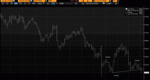
Summary: This technical pattern is most often a reversal pattern, but not always. It may be a continuation pattern in the dollar against the yen. It highlights the importance of the JPY100 level and warns of risk toward JPY92.50. It aligns well with the sequence of macro events. This Great Graphic was created on Bloomberg. I use it to illustrate a possible head and shoulder pattern that has been carved by the...
Read More »Great Graphic: Bullish Emerging Market Equity Index
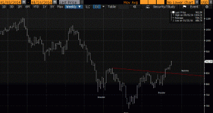
Summary: Liquidity rather than intrinsic value seems to be driving EM assets. MSCI EM equity index looks constructive technically. The chart pattern suggests scope for around 13% gains from here. Scratch an investor, and you will find two models. One is a fair value model, perhaps based on free-cash-flow or earnings expectations, or breakup value. The other is based on liquidity. We suspect that the latter...
Read More »No Fines for Iberia, but Remedial Action Demanded and Possible Loss of Some ESI Funds
Summary: Spain and Portugal need to make some relatively small budget adjustments or will be denied some transfer payments. Spain’s political situation is fluid, but another window of opportunity to break the logjam is at hand. The euro seems immune to these fiscal developments; some retracement objectives are in sight. The eurozone finance ministers have accepted the EC’s recommendation that Spain and...
Read More »Great Graphic: The Decline in Durable Goods Prices
Summary: Service prices are rising, while goods prices have steadily fallen. Non-durable goods prices are stabilizing, while durable goods prices are still falling. The decline in durable goods prices is an important economic development. The rust line is service prices. They are steadily increasing. No deflation or disinflation here. Think about rent, medical services, education, and entertainment. The three...
Read More » Swiss Economicblogs.org


