Pater Tenebrarum
My articles My siteAbout meMy booksMy videos
Follow on:TwitterFacebook
Seeking Alpha
Economic Activity Seems Brisk, But… Contrary to the situation in 2014-2015, economic indicators are currently far from signaling an imminent recession. We frequently discussed growing weakness in the manufacturing sector in 2015 (which is the largest sector of the economy in terms of gross output) – but even then, we always stressed that no clear recession signal was in sight yet. US gross output (GO) growth year-on-year, and industrial production (IP) – note that GO continues to be published with a lag of two quarters. As the upper half of the illustration shows, growth in manufacturing output turned negative in 2014 – 2015, while y/y growth in “all industries” GO fell to zero by Q3 2015. The lower half shows the
Topics:
Pater Tenebrarum considers the following as important: Chart Update, Debt and the Fallacies of Paper Money, Featured, newsletter, On Economy
This could be interesting, too:
Nachrichten Ticker - www.finanzen.ch writes Die Performance der Kryptowährungen in KW 9: Das hat sich bei Bitcoin, Ether & Co. getan
Nachrichten Ticker - www.finanzen.ch writes Wer verbirgt sich hinter der Ethereum-Technologie?
Martin Hartmann writes Eine Analyse nach den Lehren von Milton Friedman
Marc Chandler writes March 2025 Monthly
Economic Activity Seems Brisk, But…Contrary to the situation in 2014-2015, economic indicators are currently far from signaling an imminent recession. We frequently discussed growing weakness in the manufacturing sector in 2015 (which is the largest sector of the economy in terms of gross output) – but even then, we always stressed that no clear recession signal was in sight yet. US gross output (GO) growth year-on-year, and industrial production (IP) – note that GO continues to be published with a lag of two quarters. As the upper half of the illustration shows, growth in manufacturing output turned negative in 2014 – 2015, while y/y growth in “all industries” GO fell to zero by Q3 2015. The lower half shows the culprit: the mining sector, which includes upstream oil and gas production. While the sector is small, it is very volatile and accounted for an uncommonly large share of capex due to the shale oil/fracking boom. This was confirmed by the action in credit spreads during this time period as well, as junk bond spreads exploded mainly due to a relentless sell-off in energy company debt in the wake of plunging oil prices. Although happy times are here again following the oil price recovery, GO has begun to weaken slightly again in Q1 and Q2 2017 (note: the surge in IP since then does not tell us much, as GO leads IP). |
US Gross Output, Sep 2012 - Jan 2018 - Click to enlarge |
| There are a number of “sine qua non” indicators, such as real gross private domestic investment, the Philly Fed’s US leading index, the ISM/PMI indexes, initial unemployment claims, the yield curve (here in the form of the 10 year minus 2 year spread), and the National Financial Conditions Index, which routinely provide early warning signals ahead of economic downturns.
In 2015 no clear recession signal was evident from these indicators and they are now even further removed from giving such a signal. The yield curve is a potential exception – it has flattened significantly throughout last year, and its recent upturn may be the beginning of a trend change toward steepening (it is still too early to tell). A sustained trend change traditionally constitutes a recession warning. The Citigroup economic surprise index has turned down this year after rising relentlessly in the second half of 2017. This indicates that economists have finally adjusted their expectations after a series of strong data releases, just as these data begin to weaken somewhat. If the current downtrend persists, it may become meaningful for stock and bond markets in the short to medium term (usually slightly negative for the former and positive for the latter). The Citigroup economic surprise index has begun to turn down late last year (compares economic data releases to the average expectations of economists/analysts). This index is very volatile and rather short-term oriented. It may be worth watching now, as the recent stock market correction has led to wild gyrations in various positioning data. And yet, even though economic activity in terms of various macroeconomic aggregates seems to be strong, some data points are contradicting the happy picture. |
SPX and Economic Surprise Index, Jun 2017 - Feb 2018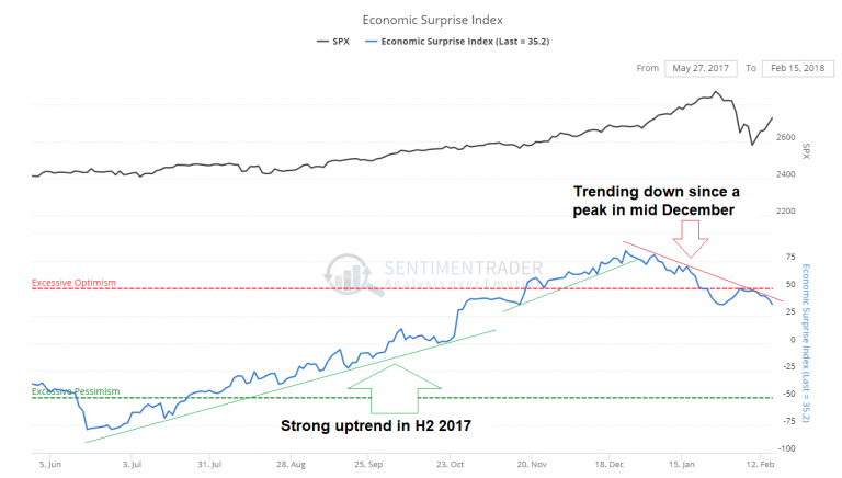 - Click to enlarge |
Weird Smoke SignalsThe character of the labor market has changed significantly since the GFC (2008 crisis). The participation rate remains at levels last seen four decades ago and anecdotal evidence points to an ongoing skills mismatch – an effect of previous malinvestment with respect to human capital that has proved quite persistent. The low unemployment rate is therefore probably not as meaningful as it appears at first glance. As an aside to this, the form used for the monthly establishment survey was altered significantly in 2012 (for the first time since 1915!), a change that is suspected of having introduced an upward bias to the data. Perhaps the gap between the apparent and actual strength in employment explains the data points below. First, there is an odd uptrend in both consumer and business loan delinquencies since ~2015 (the latter have dipped slightly of late, but the former have continued to tick up). Added together, the figures appear more consistent with a recession than an economic expansion. Consumer and business loan delinquencies at commercial banks – the second chart shows the aggregate figure. These are absolute numbers, and while that means that they are not as significant relative to the money supply and total economic output as in previous years, it is still surprising that they are in a strong uptrend since 2014-2015 and have reached levels slightly exceeding those seen in the two run-of-the-mill recessions before the GFC. |
Consumer Loan Delinquencies, Commercial and Industrial and Aggregate Consumer and C&I Loan Delinquencies, 1988 - 2018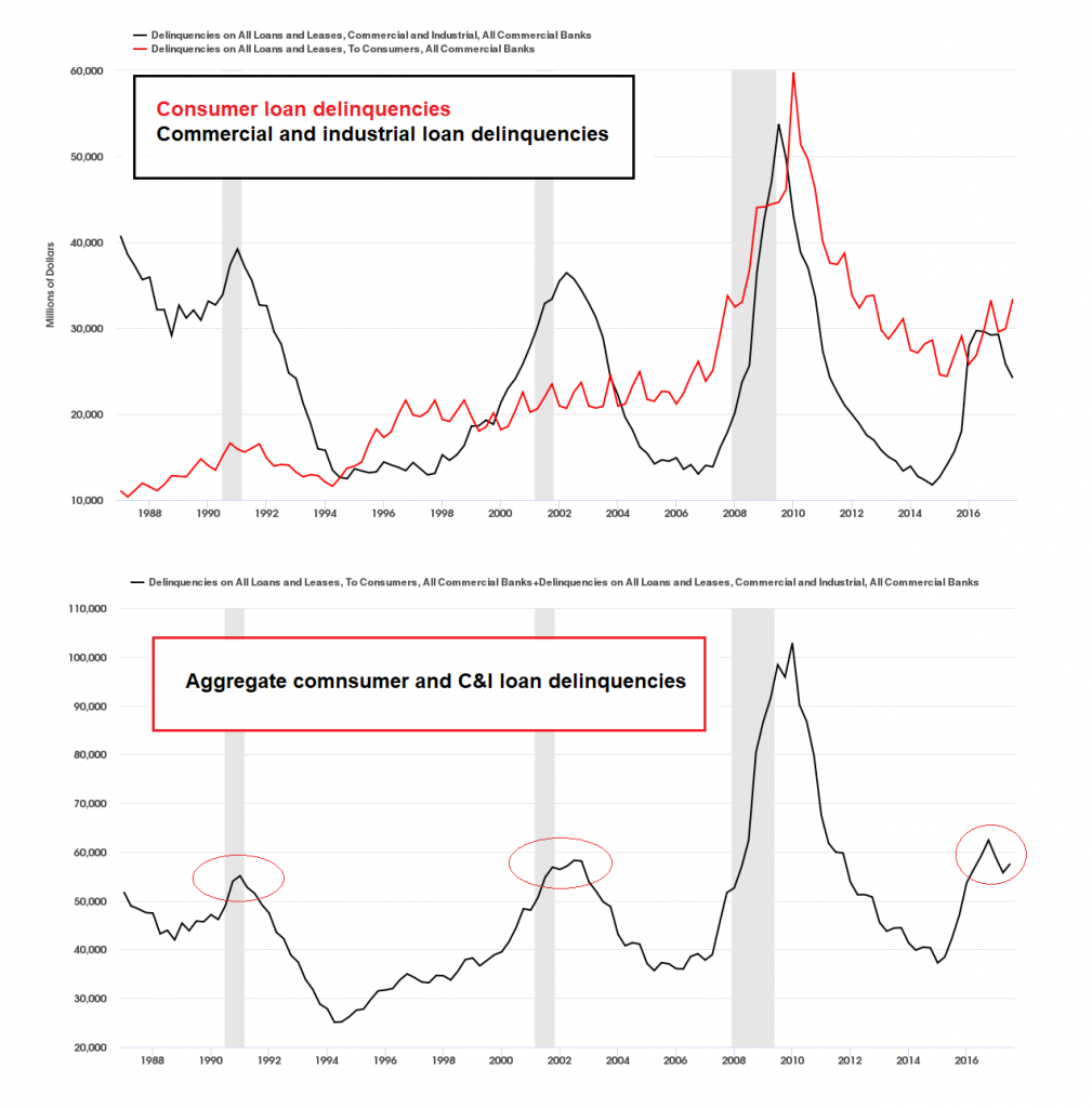 - Click to enlarge |
| It is hard to imagine that the small tightening steps taken by the Fed have triggered such a big surge in delinquencies. While business loan delinquencies may have been pushed up by the 2014-2015 crisis in the oil patch, the high level of consumer loan delinquencies is quite baffling, particularly in light of consumer confidence recently reaching the highest level since the peak of the dotcom mania in 2000 (as per the Conference Board survey).
The next oddity is the ongoing weak y/y growth rate in federal tax revenues – keep in mind that the figures do not reflect the effects of the recently enacted tax cuts yet. Normally growth in federal tax receipts tends to follow GDP growth with a slight lag and exceeds it significantly. Persistently low to negative growth rates such as those prevailing since Q1 2016 are usually seen just before or during recessions. We also want to draw your attention to the growth in tax revenues during the Clinton boom (a.k.a. the “Great Moderation”), when so-called “Goldilocks” economic conditions obtained. This is to say, relatively modest economic growth, low price inflation and low unemployment, combined with staggering debt growth in the private sector and a giant asset bubble. Arguably, recent economic conditions are quite similar in these respects (with the main difference consisting of the fact that public debt is growing rapidly as well). Since Q1 2016, year-on-year growth in federal tax receipts has oscillated between negative to moderately positive, which is quite unusual during a reportedly strengthening economic expansion accompanied by a sizable asset price bubble. The comparable backdrop in the 1990s saw very steady growth in tax receipts, which exceeded GDP growth markedly without interruption from Q2 1992 until Q2 2001 (when the recession was already underway – and even at that point, growth in tax revenues was still slightly positive). This feels a bit like an economic upswing with recessionary undertones, so to speak. We will soon take another look at developments in credit spreads in this context (or perhaps we should better say non-developments), as well as a few bond market oddities. We have only recently become aware of some of the more esoteric products brought into the world by post-GFC financial engineering efforts, many of which probably remain below the radar of most market observers. We were surprised to learn what huge amounts some of these obscure products have attracted. |
Federal Tax Receipts, 1968 - 2018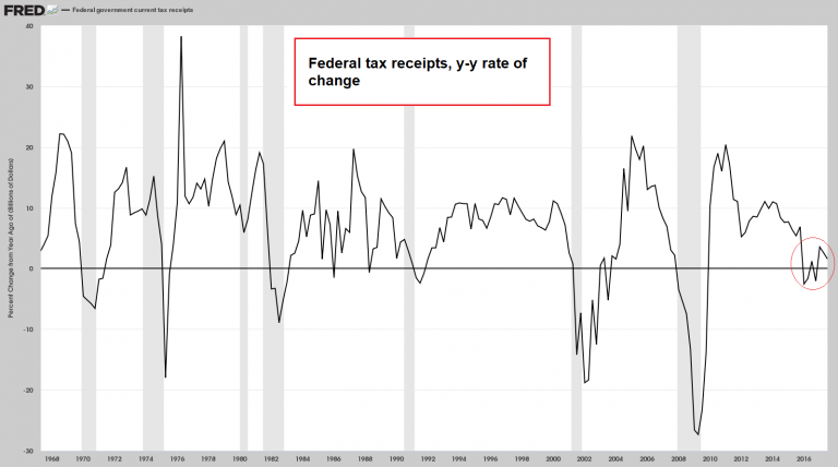 - Click to enlarge |
When the Tide Goes OutLastly, we have created a chart of y/y true money supply growth (TMS-2) that includes a 12-month moving average of the growth rate. The moving average is set to decline further, and based on precedent it is by now very close to levels at which effects on economic activity and asset prices should be expected to come to the fore. At the same time, it is fairly certain that headline price inflation will rise further in the near term (mainly due to oil price-related base effects) – in other words, the Fed is very likely to continue to tighten. Speaking of inflation, some of the recent big swings in positioning data indicate that speculators in the futures markets are increasingly betting on higher price inflation as well. Whether they will be right remains to be seen, but it is definitely an interesting development (we will have more to say about this shortly). Year-on-year growth in US broad true money supply TMS-2 with 12-month moving average. So far the lagged effect of the previous strong growth in money supply continues to predominate, indirectly supported by the QE operations of ECB and BoJ, which continue to keep credit spreads in check – so far, anyway. |
Annual Growth Rate of TMS-2, Feb 1996 - 2018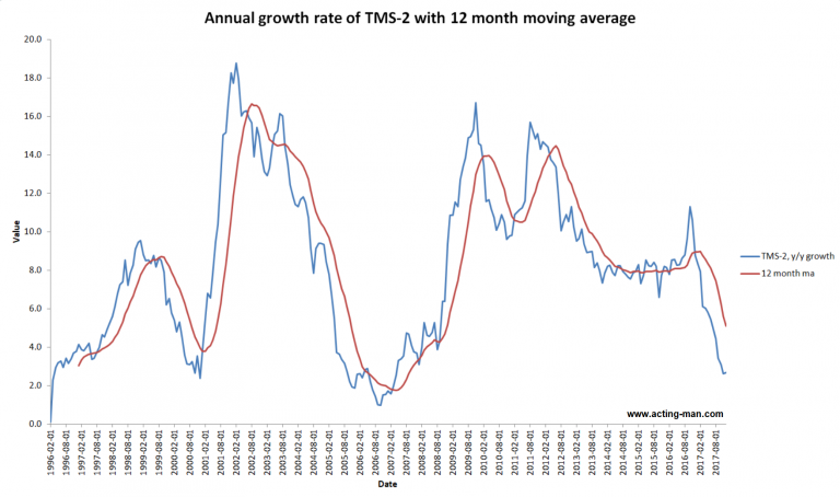 - Click to enlarge |
| Here is a snapshot of assets held by the Federal Reserve, which shows the initial effects of the new “QT” era. |
Federal Reserve Banks Total Assets, Jan 2015 - 2018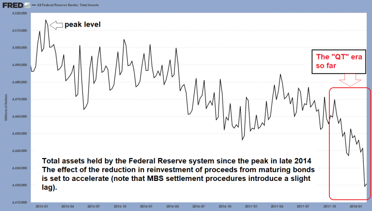 - Click to enlarge |
| Assets held by the Fed are beginning to decline. This is bound to accelerate noticeably in coming months. Readers who want to know why exactly MBS settlement procedures result in delays in the reporting of agency portfolio reductions can check out a detailed explanation here.
It certainly seems to us as though the tide is about to go out. And as the saying goes, “when the tide goes out, you will learn who was swimming naked”. We have a suspicion that a very crowded nudist beach will be revealed when the waves retreat this time around. |
 Illustration by Dale Crosby - Click to enlarge Once the tide goes out… |
Tags: Chart Update,Featured,newsletter,On Economy