Bad Reputation Years ending in 7, such as the current year 2017, have a bad reputation among stock market participants. Large price declines tend to occur quite frequently in these years. Just think of 1987, the year in which the largest one-day decline in the US stock market in history took place: the Dow Jones Industrial Average plunged by 22.61 percent in a single trading day. Or recall the year 2007, which marked the beginning of the GFC (“great financial crisis”). Given that the current year is ending in 7 as well, is there a reason to be concerned, or is the year 7 crash pattern a myth? Sliding down the steep slope of the cursed year. - Click to enlarge The Pattern of the Dow Jones Industrial Average
Topics:
Dimitri Speck considers the following as important: Debt and the Fallacies of Paper Money, Featured, newslettersent, On Economy, The Stock Market
This could be interesting, too:
Nachrichten Ticker - www.finanzen.ch writes Die Performance der Kryptowährungen in KW 9: Das hat sich bei Bitcoin, Ether & Co. getan
Nachrichten Ticker - www.finanzen.ch writes Wer verbirgt sich hinter der Ethereum-Technologie?
Marc Chandler writes March 2025 Monthly
Mark Thornton writes Is Amazon a Union-Busting Leviathan?
Bad ReputationYears ending in 7, such as the current year 2017, have a bad reputation among stock market participants. Large price declines tend to occur quite frequently in these years. Just think of 1987, the year in which the largest one-day decline in the US stock market in history took place: the Dow Jones Industrial Average plunged by 22.61 percent in a single trading day. Or recall the year 2007, which marked the beginning of the GFC (“great financial crisis”). Given that the current year is ending in 7 as well, is there a reason to be concerned, or is the year 7 crash pattern a myth? |
|
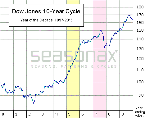
The Pattern of the Dow Jones Industrial Average in the Course of a DecadeBelow you can see a chart of the typical pattern of the DJIA in the course of a decade. This is not a standard chart. Instead it shows the average price pattern of the DJIA in the course of a decade since 1897. The horizontal axis shows the years of the decade, the vertical axis the average performance of the index. Thus one can discern at a glance how the index typically performs in individual years depending on what their last digit happens to be. As you can see, in the first half of the decade, i.e. in the years ending in 0 to 4, the DJIA barely rose on average. By contrast, in years ending in 5 (highlighted in yellow above) the performance of the index tended to be particularly strong. Alas, years ending in 7 (highlighted in red) typically saw a sharp retreat in prices in the second half of the year. Thus it appears as though the stock market is indeed generating a specific pattern in a 10-year cycle. Is this sheer coincidence, or does such a 10-year stock market cycle really exist? In order to assess that, we will take a close look at the 19th century as well. Due to the length of the 10-year cycle pattern there are basically no other time periods one can sensibly review in this context. |
Dow Jones 10 Year Cycle, 1987 - 2015 |
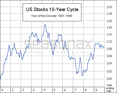
The 10-year cycle in the 19th centuryThe next chart shows the pattern of the 10-year cycle during the 19th century. Note: in this time period, average stock price increases were far less pronounced than thereafter. As a result the values on the vertical axis are noticeably smaller. As you can see, in the 19th century, stock prices on average also tended to fall in the second half of years ending in 7. However, overall the 10-year cycle pattern in the 19th century was nevertheless quite different from the pattern that evolved in the 20th century and beyond, which we have shown in the first chart. One obvious example is that in the 19th century the market on average tended to rally in the first half of every decade, and essentially went sideways in the second half. |
US Stocks 10 Year Cycle, 1801 - 1899In the 19th century prices declined in the second half of years ending in 7 as well. A major reason for the comparatively smaller nominal capital gains stocks generated in the 19th century was of course the use of sound money, i.e., the gold standard. In the absence of incessant money printing, perceptions of risk were markedly different as well, hence a far large proportion of the total return was provided by dividends, which price charts don’t reflect. More importantly though, if one looks at the stock market priced in gold, this is to say, if one looks at real stock prices – and only stock prices in terms of sound money are “real” (adjusting them by dubious statistics like CPI or PPI doesn’t make much sense to us) – it can be shown that the real returns generated prior to the establishment of the Fed were far greater than the returns generated thereafter. In fact, in real money terms the stock market remains frozen at levels last seen in the late 1920s. That’s almost an entire century of going nowhere in interesting ways. |
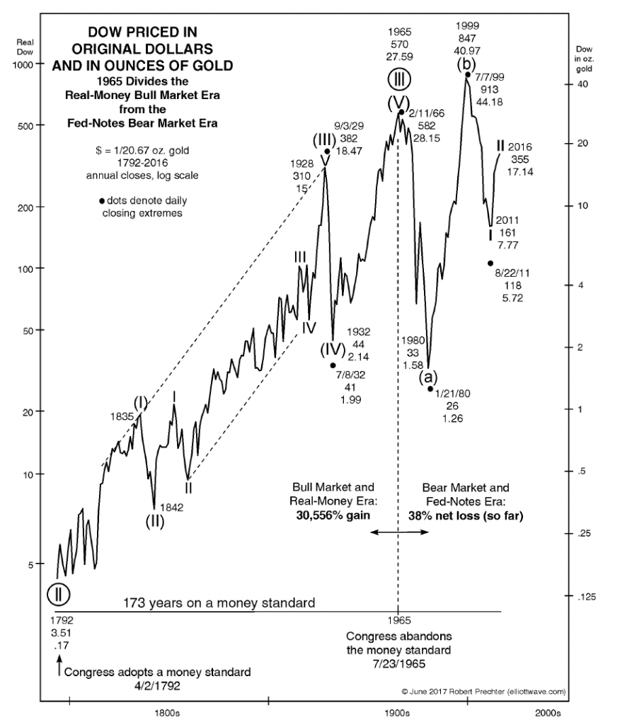
Annual Seasonality has far Stronger UnderpinningsAs you can see, the 10-year cycle pattern appears to be a less stable phenomenon than annual seasonal patterns, in the course of which certain phenomena such as the year-end rally tend to recur with remarkable regularity. Why is that? There is no sound fundamental reason for the existence of these 10-year patterns. Perhaps the 10-year cycle does trigger certain human behavior – e.g. in the form of a self-fulfilling prophecy, as people who are aware of the pattern may take action based on it. But that does not appear to suffice to make the 10-year cycle a pattern that is likely to reliably influence market trends. The case of annual seasonality is different. Numerous factors can be shown to have an impact on it: they range from the weather, to holidays, to earnings reporting dates, and the associated effects, such as window-dressing by portfolio managers or recurring industry-specific events such as e.g. fairs. Annual seasonality can assist in optimizing investment strategies for all types of financial instruments. Simply take advantage of the information provided at www.seasonalcharts.com or www.seasonax.com. Numerous statistically stable cycles can be found there. There are also countless event-related market patterns – regularly recurring patterns are not only based on annual seasonality. Alternatively, if you have access to a Bloomberg or Reuters system, type “APPS SEASON” into the search bar of your Bloomberg Professional Terminal, or select the App Studio in the Thomson-Reuters Eikon menu and then choose the Seasonax app. For additional background information on the Seasonax app, see here: “Seasonax – What It Is And What It Can Do For You”. PS: Cyclical patterns based on solid fundamental reasons are more robust! Addendum by PT: A Special ChartThe following chart was originally published by Robert Prechter in the Elliott Wave Theorist in June. It shows that investors enjoyed far greater real returns in the stock market when the US still used sound money and eschewed central planning by a monetary authority. |
Dow Prices in Dollar and Gold, 1792 - 2016 A chart that speaks for itself: not only was per capita real economic growth under the gold standard and prior to the advent of the Fed much stronger than thereafter, but investors actually made truly large gains in the stock market in real terms. - Click to enlarge Under the metallic money standard (Bob Prechter deems it to have ended with the abandonment of the last silver dollars in 1965) the market posted a real gain of 30,556%. Since then, it has actually lost 38% in real terms! This is quite an indictment of the centrally planned fiat money standard amd yet another reason to abandon it and return to sound money and free banking. |
Tags: Featured,newslettersent,On Economy,The Stock Market


