Don’t waste your time worrying about things that are well worried. Well worried. One of the best turns of phrase I’ve ever heard in this business that has more than its fair share of adages and idioms. It is also one of the first – and best – lessons I learned from my original mentor in this business. The things you see in the headlines, the things everyone is already worried about, aren’t usually worth fretting over. The market may not be perfectly efficient but when it hits the front page of the local newspaper – or saturates the modern day equivalents, Twitter and Facebook – it is already over and doesn’t deserve your attention. In case you haven’t heard – and I don’t know how you could have possibly avoided it
Topics:
Joseph Y. Calhoun considers the following as important: 5) Global Macro, Alhambra Research, bonds, commodities, copper to gold ratio, credit spreads, Crude Oil, currencies, economy, Featured, Gold, inflation, Keynes, Markets, Monthly Macro Monitor, newsletter, Recession, TIPS, treasuries, US dollar, Yield Curve
This could be interesting, too:
Nachrichten Ticker - www.finanzen.ch writes Die Performance der Kryptowährungen in KW 9: Das hat sich bei Bitcoin, Ether & Co. getan
Nachrichten Ticker - www.finanzen.ch writes Wer verbirgt sich hinter der Ethereum-Technologie?
Martin Hartmann writes Eine Analyse nach den Lehren von Milton Friedman
Marc Chandler writes March 2025 Monthly
Don’t waste your time worrying about things that are well worried.
Well worried. One of the best turns of phrase I’ve ever heard in this business that has more than its fair share of adages and idioms. It is also one of the first – and best – lessons I learned from my original mentor in this business. The things you see in the headlines, the things everyone is already worried about, aren’t usually worth fretting over. The market may not be perfectly efficient but when it hits the front page of the local newspaper – or saturates the modern day equivalents, Twitter and Facebook – it is already over and doesn’t deserve your attention.
In case you haven’t heard – and I don’t know how you could have possibly avoided it – the yield curve inverted last week. Or at least some yield curves inverted last week, not all of them but enough to get the headline writers excited. And everyone knows, based on the breathless reporting, that the yield curve inverts prior to recession. But everyone knows that everyone knows the yield curve inverts prior to recession and everyone knows that everyone knows that everyone knows the yield curve inverts prior to recession and so I am left wondering if the fact that everyone knows all these things they think they know means that the yield curve in fact doesn’t mean what it has always meant in the past and so maybe all these people who think they know something, in fact know absolutely nothing.
I’ve been doing this a long time and I don’t ever remember so much attention being paid to something only bond nerds knew about 25 years ago. Now everyone talks about “the” yield curve as if they’ve known about it all their life, a lesson learned in the crib. All babies know that if they cry, one of those zombie looking people who keep calling themselves “mama” and “dada”, as if they can’t speak English, will come running with a wipe, some powder and a fresh diaper or at least a fresh bottle – and that the yield curve inverts prior to recession.
Have we reached the fourth or fifth order of Keynes’ beauty contest? With all the attention paid to the yield curve over the last year or so, it seems possible – likely – that the inversion became somewhat of a self-fulfilling prophecy. Knowing that everyone knows the yield curve inverts prior to recession, some might try to get a little ahead of the crowd and buy bonds when the yield curve hits 20 basis points. And maybe another group waits a little longer but buys bonds when the curve hits 10 basis points. And so on, until the curve inverts merely because everyone is trying to stay one step ahead of all the other people who know the yield curve inverts prior to recession. And pretty soon your Mom is calling to see if you know anything about this yield curve thing she saw on the Today Show.
Obviously, I’m being a tad facetious, treating this very important economic indicator as a bit of a joke, but seriously, wasn’t the coverage of the yield curve inversion a tad overwrought last week? And superficial if I might say so. There really is no such thing as “the” yield curve. There are lots of curves and just as many ways of interpreting them. The Eurodollar futures market has been inverted for months, future yields trading below today’s, an indication that market started to price in a probability of a rate cut long before the Treasury market. But it doesn’t mean recession is imminent or even assured. And neither does the inversion of the Treasury curve between the 3 month bill yield and the 10 year note yield.
|
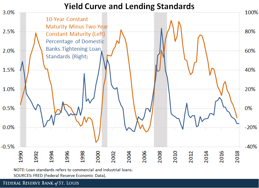
The inversion of the yield curve – and I’ll use “the” here to refer to Treasuries across a variety of maturities – is not a recession signal. It seems like it should be because the curve has inverted prior to a bunch of modern day recessions but the reality is that we don’t even know why it inverts prior to recession. Well, that isn’t exactly true. The curve generally inverts because the Fed hikes rates too far, causing angst among the bond crowd who buy the long end and push long rates down below short rates. Except, you see, that doesn’t really mean anything. Those bond traders buying long term bonds don’t know the Fed has tightened too much. An inverted yield curve merely represents the bond – and money – market’s collective wisdom about future growth. The Fed may control short term rates (although that is a lot more iffy than we once thought) but long term rates are a distillation of the market’s expectations for nominal growth (real growth + inflation). Since the yield curve has inverted prior to the last seven US recessions, we are left with the choice that either bond markets are clairvoyant or yield curve inversions cause recessions. Neither is particularly satisfying. There is some support for the idea that inversions actually cause recessions. Banks borrow short and lend long so when short rates are higher than long rates their profit margins are squeezed. Their response is to tighten lending standards: |
Yield Curve and Lending Standards 1990-2018 |
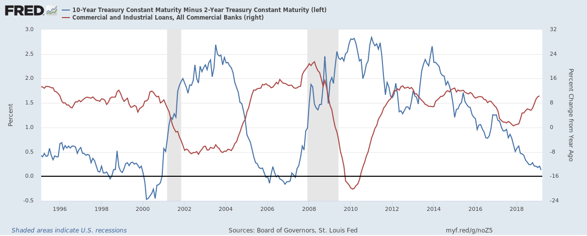
| But we also know that the vast majority of corporate lending in the US doesn’t happen through the banking channel. And even if banks say they are tightening lending standards it doesn’t mean they actually stop lending. In the last two recessions, C&I loan growth continued well after the inversion and didn’t really fall off until the recession had already started.
I have some sympathy for the view that inversions cause recessions, a real world example of George Soros’ theory of reflexivity. But perception today is distorted through the fun house mirror of social media and unconventional monetary policy. Like everyone else I’m still trying to figure out how that impacts markets but I’m pretty sure it doesn’t make them more efficient. One thing I am still pretty sure of though is that my mentor had it right so many years ago. All the media coverage of the yield curve in recent times may have created the conditions for the curve to invert. But its popularity also means its usefulness as a recession indicator is likely much less than it once was. Whatever the yield curve inversion really means today, it is different than it was 10, 20 or 40 years ago when most everyone had no idea what the heck it was. Having said all that, the economy is slowing – as I’ve warned it would in these missives the last few months – and we have ample confirmation of that in other markets. Whether it turns into recession is something we won’t know for some time. One thing everyone selling last week may have forgotten is that the yield curve inversion, as I said above, isn’t the recession signal. Recession usually arrives a year or more after the inversion and is signaled by a rapid steepening of the curve. That is, ironically, known as a bull steepener. Bond nerds do. apparently, have a sense of humor. Let’s see what’s going on today. |
10-Year Treasury Constant Maturity Minus 2-Year Treasury Constant Maturity, Commercial and Industrial Loans 1996-2018 |
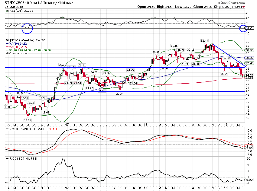
Market Indicators10-Year Treasury Note YieldThe 10 year nominal bond yield has fallen since my last update at the end of January. While everyone and his brother now seems to be bullish on bonds, I’m starting to think about fading this rally. These things tend to go in cycles and this one is getting a bit stretched. You can see that with the RSI reading at the top of the chart. You can also see it in futures markets. The speculators were massively short back in the fall but that position has been largely covered now. We may yet see specs get net long but that is not far away. |
10-Year US Treasury Yield, 2017-2019 |
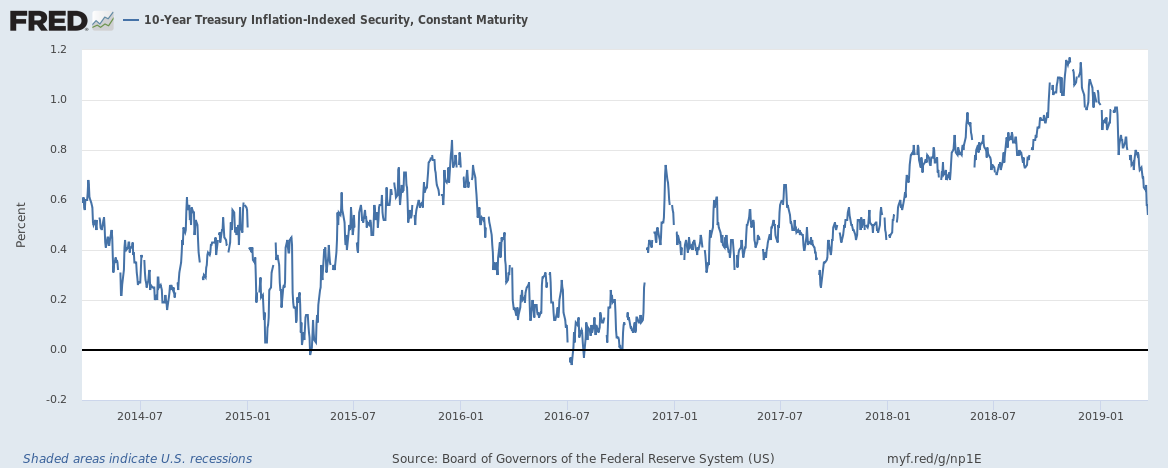
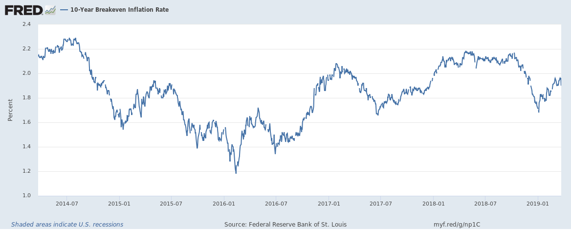
10-Year TIPS YieldThe biggest part of the move in the nominal 10 year Treasury note was driven by changing real growth expectations. You can see in the chart below of 10 year breakevens that inflation expectations have actually risen slightly since my last update in late January. |
10-Year TIPS Yield, 2014-2019 |
| TIPS yields (above), on the other hand, have fallen roughly 40 basis points in that time. That is a large change and reflects the weaker economic data we’ve been seeing. But yields are still well above the zero line where real yields fell in the 2016 slowdown. |
10-Year Breakeven Inflation Rate, 2014-2019 |
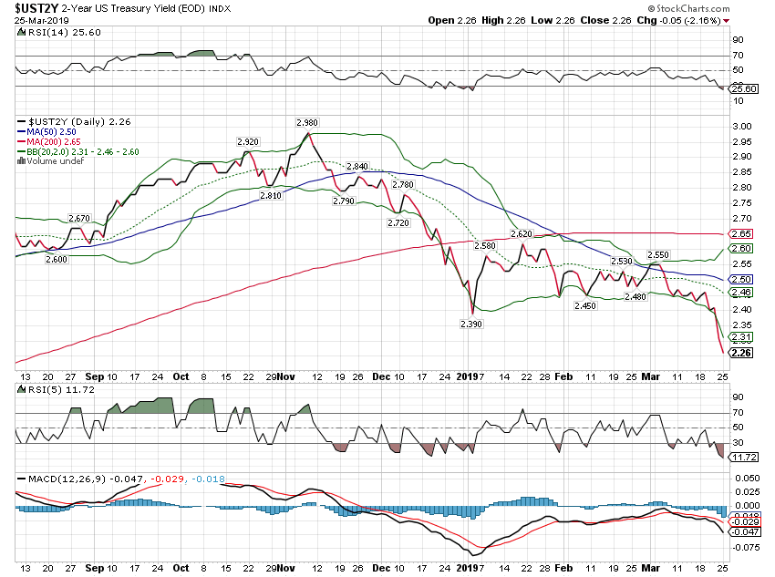
2-Year Treasury Yield2 year note yields have also fallen as future Fed rate hikes get priced out of the market. Not a big change though with the yield down about 20 basis points since late January. |
2-Year US Treasury Yield |
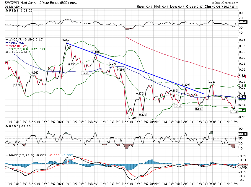
10/2 Yield CurveThe 10/2 yield curve is the one I chose to follow a long time ago. A lot of people prefer the 3 month bill yield for the short term leg but I think that is too influenced by Fed talk. I want a little more market in my measure of short term rates not just the Fed’s opinion. Anyway, as you can see this curve is one of those that didn’t invert. That really doesn’t mean anything but the recent slight steepening might. That spike higher right at the end is due to the 2 year yield falling faster than the 10 year. That is actually the recession signal we’re watching for but this isn’t big enough yet to mean anything. |
Yield Curve - 2 Year Bonds |
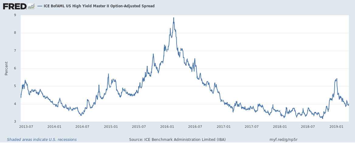
Credit SpreadsSo here’s a dog that hasn’t barked yet – credit spreads. I’m always looking for confirmation across markets and this one doesn’t support the “OMG we’re headed for recession” meme. Credit spreads narrowed by almost 40 basis points since late January. If the economy was really headed for big trouble, spreads would be widening not narrowing. That doesn’t mean they won’t eventually join the Treasury market in predicting doom but they haven’t yet. |
Credit Spreads 2013-2019 |
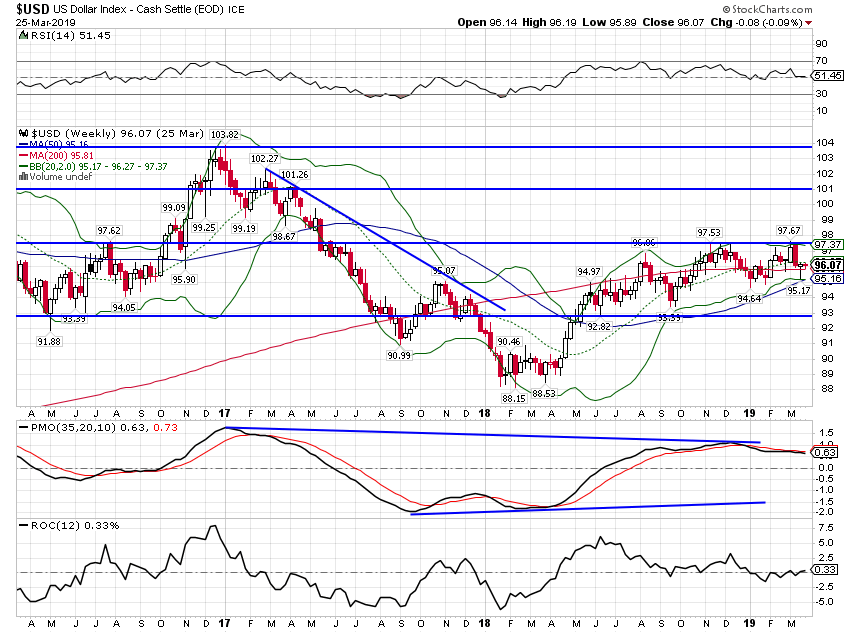
US DollarThe drop in real growth expectations – the drop in TIPS (real) yields – has kept the dollar in check. I continue to find the currency markets the most interesting aspect of today’s environment. There are a lot of longs in the dollar right now – similar to the bevy of shorts in Treasuries six months ago – but it can’t seem to get any traction for more than a few days. The overwhelming consensus is that the rest of the world – and especially Europe – is in a lot worse shape than the US economically. And yet…the Euro still trades around 1.13 and the dollar index is still stuck in the range it has been in for almost a year. How in the world is the Euro not trading at par like everyone predicted a few years back? The European economy is arguably worse now than it was then and the US is better which ought to be dollar positive. For that matter, the dollar today, trading around 96, is about the same as it was at the beginning of 2015. Another thing I learned from my mentor is that when something isn’t acting as it “should” then something is wrong with your thesis. If your thesis is that the US economy is a lot better than the rest of the world – MAGA and all that – which would mean a rising dollar, you may need to reassess. The dollar is telling you that either the US is worse than it appears or the rest of the world is better. |
US Dollar Index 2017-2019(see more posts on US Dollar Index, ) |
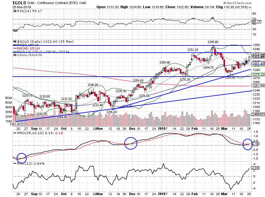
CommoditiesAnother asset that may be pointing to a weaker dollar in our future is gold which continues in a bull trend despite the dollar stability. Gold is essentially rallying against all currencies so maybe this has more to do with global monetary policy than anything US specific, but gold is nearing a break out point that would point to much higher prices if breached (see below). |
Gold - Continuous Contract(see more posts on Gold, ) |
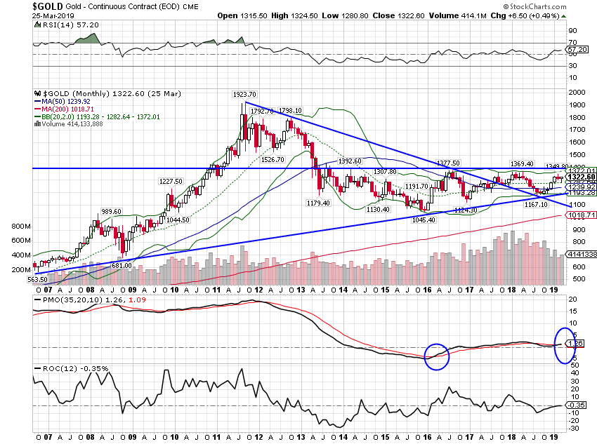
| A strong breakout above $1400 likely sends gold back to its highs. You might ask yourself what could cause such a thing. |
Gold - Continuous Contract, 2007-2019 |
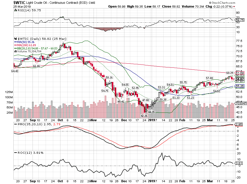
| Crude oil has also continued higher since early in the year. Not exactly what one would expect from an economy on the brink of recession, especially with a stable dollar. |
Light Crude Oil, monthly(see more posts on Crude Oil, ) |
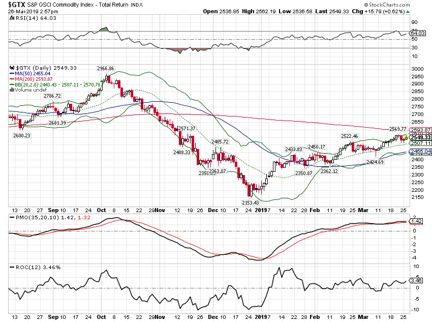
| The broader but still energy heavy GSCI has tracked crude oil higher. |
S&P GSCI Commodity Index, monthly |
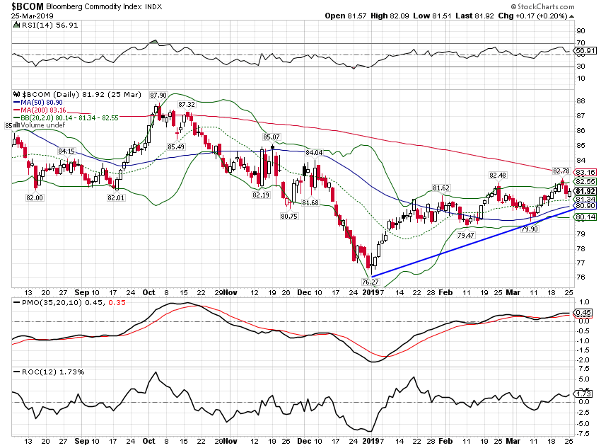
| The Bloomberg Commodity Index is weighted more evenly across the commodity complex and has also trended higher this year. Again, not what we would expect to see if the economy is headed south. Commodity markets are volatile though so it could still go that way if the economic stats stay weak. But for now, I’d call this a non-confirmation of the recession fear trade in bonds. |
Bloomberg Commodity Index, monthly |
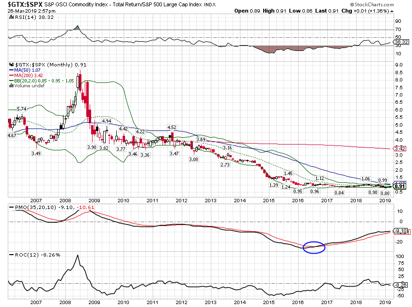
| It is also interesting to note that the GSCI, very quietly, has basically matched the performance of the S&P 500 for the last two years. And long term momentum favors commodities. |
S&P GSCI / S&P 500 Large Cap Index, 2007-2019(see more posts on S&P 500 Large Cap Index, ) |
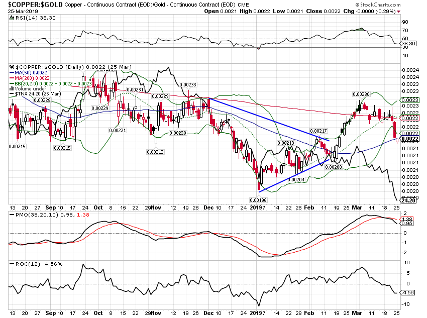
| The copper to gold ratio has, like the general commodity indexes, trended higher this year. We watch this ratio primarily for guidance on rates. It was weak all last year and although delayed, the bond market did eventually catch up. Despite the recent pullback, the ratio is now pointing to higher rates. That may not happen immediately but if copper continues to rise relative to gold, rates will eventually follow. |
Copper / Gold, monthly |
Tags: Alhambra Research,Bonds,commodities,copper to gold ratio,credit spreads,Crude Oil,currencies,economy,Featured,Gold,inflation,Keynes,Markets,Monthly Macro Monitor,newsletter,recession,TIPS,treasuries,US dollar,Yield Curve

