Business under Pressure A recent post by Mish points to the fact that many of the business-related data that have been released in recent months continue to point to growing weakness in many parts of the business sector. We show a few charts illustrating the situation below: A long term chart of total business sales. The recent decline seems congruent with a recession, but many other indicators are not yet confirming a recession – click to enlarge. Wholesale inventories to sales ratio – ever since the widespread adoption of just-in-time inventory management, such a high level in the I/S ratio indicates a weakening economy – click to enlarge. The Atlanta Fed’s GDP Now model shows that economists were once again too optimistic about Q1 growth. Lastly, here is a chart recently presented by Albert Edwards of SocGen, which shows domestic economy-wide non-financial earnings growth in the US. Edwards argues that investment spending tends to follow profit growth, which intuitively makes sense (we offer an alternative explanation for this relationship below). He therefore expects the recent downturn in GAAP earnings to be followed by cutbacks in capital expenditures: US non-financial economy-wide profits have begun to decline to the “recession threshold” – investment tends to follow with a lag – click to enlarge.
Topics:
Pater Tenebrarum considers the following as important: Chart Update, Debt and the Fallacies of Paper Money, Featured, newsletter, On Economy
This could be interesting, too:
Nachrichten Ticker - www.finanzen.ch writes Die Performance der Kryptowährungen in KW 9: Das hat sich bei Bitcoin, Ether & Co. getan
Nachrichten Ticker - www.finanzen.ch writes Wer verbirgt sich hinter der Ethereum-Technologie?
Martin Hartmann writes Eine Analyse nach den Lehren von Milton Friedman
Marc Chandler writes March 2025 Monthly
Business under Pressure
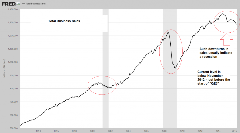
A recent post by Mish points to the fact that many of the business-related data that have been released in recent months continue to point to growing weakness in many parts of the business sector. We show a few charts illustrating the situation below:
A long term chart of total business sales. The recent decline seems congruent with a recession, but many other indicators are not yet confirming a recession – click to enlarge. |
 |
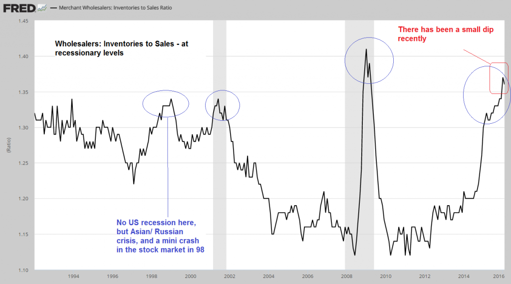
Wholesale inventories to sales ratio – ever since the widespread adoption of just-in-time inventory management, such a high level in the I/S ratio indicates a weakening economy – click to enlarge. |
 |
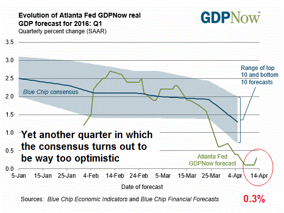
The Atlanta Fed’s GDP Now model shows that economists were once again too optimistic about Q1 growth. |
 |
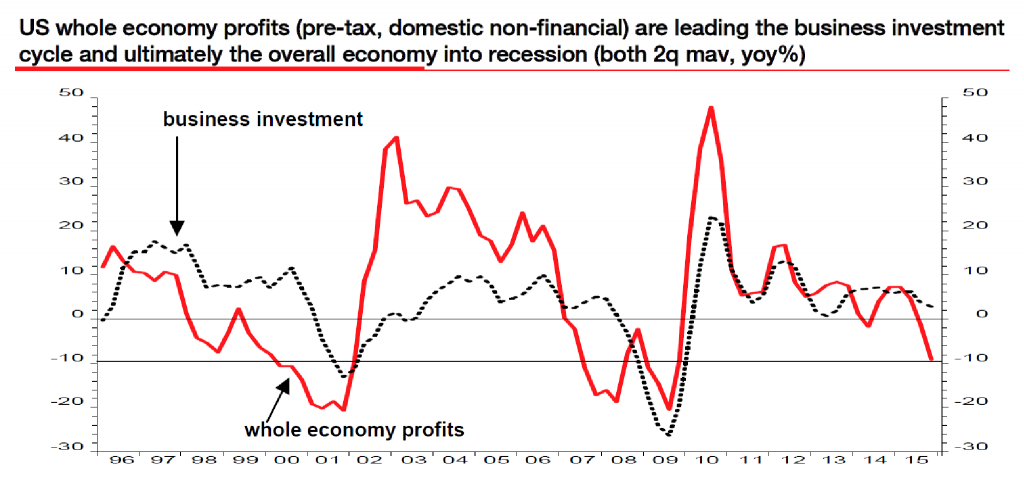
Lastly, here is a chart recently presented by Albert Edwards of SocGen, which shows domestic economy-wide non-financial earnings growth in the US. Edwards argues that investment spending tends to follow profit growth, which intuitively makes sense (we offer an alternative explanation for this relationship below). He therefore expects the recent downturn in GAAP earnings to be followed by cutbacks in capital expenditures:
US non-financial economy-wide profits have begun to decline to the “recession threshold” – investment tends to follow with a lag – click to enlarge. |
 |
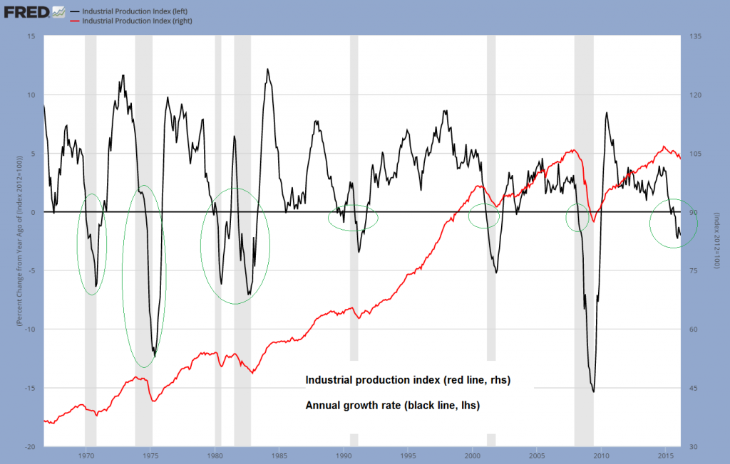
A long term chart of the annual growth rate in industrial production shows that the extent of the recent decline has usually not been seen outside of recessions either. Very small and short-lived dips into slightly negative territory occasionally turn out to be meaningless, but not declines of the size recently witnessed. While the chart below begins only in the late 1960s, we have ascertained that this actually holds true for the entire post WW2 era.
Industrial production index and y/y growth rate, long term – click to enlarge. |
 |
Conventionally a lot of blame for the recent weakness is attributed to weak oil prices and the stronger dollar. These factors have certainly exerted some influence. For instance, shale oil production has been a large contributor to investment and employment growth at the margin. Meanwhile, total goods exports have declined noticeably as well.
On the other hand, the decline in energy prices lowers input costs for a great many industries and is also a tailwind for consumers. Moreover, the impact of exchange rates on trade is probably smaller than is widely held. If one looks e.g. at Germany’s trade data during strong and weak euro periods in recent years, little of the expected correlation is evident and the same hold for Japan’s trade data (in Japan, the opposite of what was expected has happened).
Weakness in US exports has probably more to do with weakness in economic growth overseas than with the dollar’s exchange rate. We are therefore going to look at the problem from a different perspective.
A Distorted Capital Structure
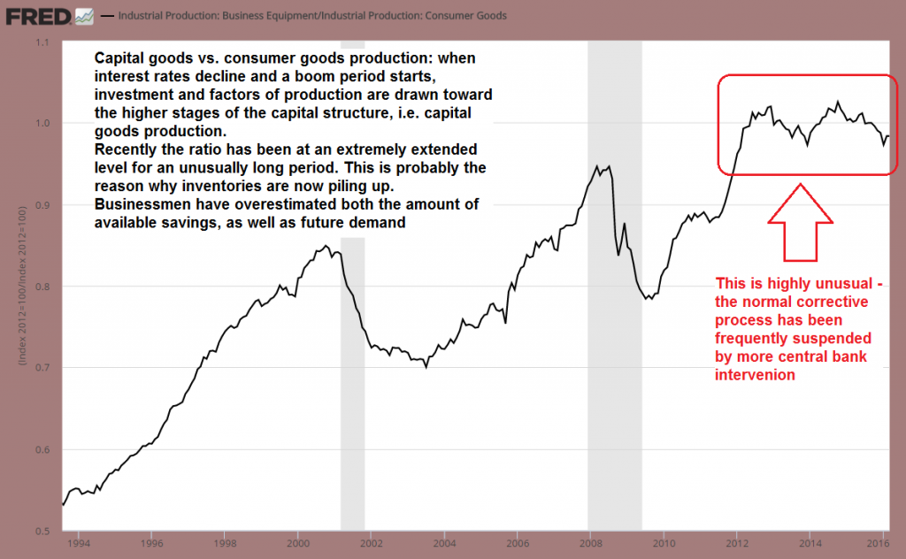
The industrial production index shown above is chain-weighted Fisher index that measures the estimated real value added by the combined output of manufacturing, mining and utilities. All such indexes suffer from the usual problems one encounters with aggregation, but by comparing various sub-indexes, one can get a rough idea of which stages of the economy’s production structure are attracting the largest share of investment.
As one would expect, whenever interest rates decline and the money supply and credit expand, economic activity shifts to the higher stages of the capital structure, i.e., capital goods production, mining, real estate – everything that is temporally distant from the final goods stage. This is not problematic when real savings have actually increased and interest rates decline on account of lower time preferences. However, it becomes a problem when interest rates are artificially lowered in the course of credit expansion from thin air.
Below we show the ratio of capital vs. consumer goods production. Typically this ratio will rise during boom periods and decline during busts.
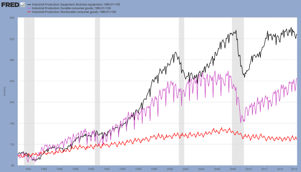
Looking at the sub-indexes themselves, one can also see that following the 2008 crisis, capital and consumer goods production have drifted apart in an unusual way. Consumer goods production has only recovered very reluctantly, resp. not at all in the case of non-durables. The next chart shows the production indexes for capital goods, durable and non-durable consumer goods since the early 1980s:
Capital goods production (black line), durable consumer goods (purple line) and non-durable consumer goods production (red line) – click to enlarge. |
 |
If one thinks about the nature of real savings, they consist of final goods that have been produced but not consumed, and can therefore be employed to sustain those working in longer term projects. If a sufficient amount of real savings is available, the production structure can be lengthened, thereby becoming more productive in the long term.
This requires however that market interest rates are left to their own devices – if they are not, too much will be invested in the wrong lines (as a rule, interest rates are manipulated downward, resulting in too many factors of production being attracted to the higher stages). Since there is a continual stream of consumer goods emerging, it takes a while for businessmen to notice that there is an imbalance, that relative prices have been falsified and that capital consumption has “paid” for the consumption that has taken place. Many usually notice when it is too late (such as those active in the commodity industries over the past two years, who have seen their accounting profits from the boom period disappear rather quickly).
Both the amount of available savings as well as future demand are overestimated during the boom. Now inventories are however rising, with the bulk of the build-up occurring in raw and intermediate goods, for which downstream demand is lower than expected. The less specific those are, the easier it is to sell them, but not at the prices they once commanded.
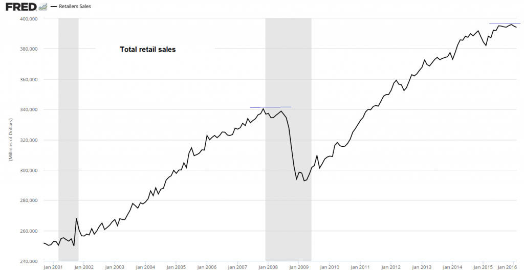
Next we take a look at retail sales. As can be seen, retail sales have increased far above their pre-crisis peak in recent years, even though consumer goods production has been neglected.
Retail sales since 2001 – click to enlarge. |
 |
In short, the balance between saving and consumption was actually not really supportive of the relative increase in capital goods production. Time preferences were higher than the Fed-manipulated market interest rate backdrop would suggest. Of course the US economy is not a closed economy, so to some degree this also reflects a shift of lower order goods production to other countries, from whence they can be imported, while foreign savings are partly invested in the US.
We can nevertheless be quite certain that the current configuration of the capital structure is not sustainable (in certain sectors of the economy this is increasingly visible already). Given that consumption was underestimated and savings were overestimated, not all of the long-term projects that were initiated on account of low interest rates can possibly be sustained. The recent flattening in retail sales may actually indicate that the process has reached its inevitable end (i.e., that we are entering the forced saving phase of the boom, since more and more final goods have so to speak become tied up relative to those that are released).
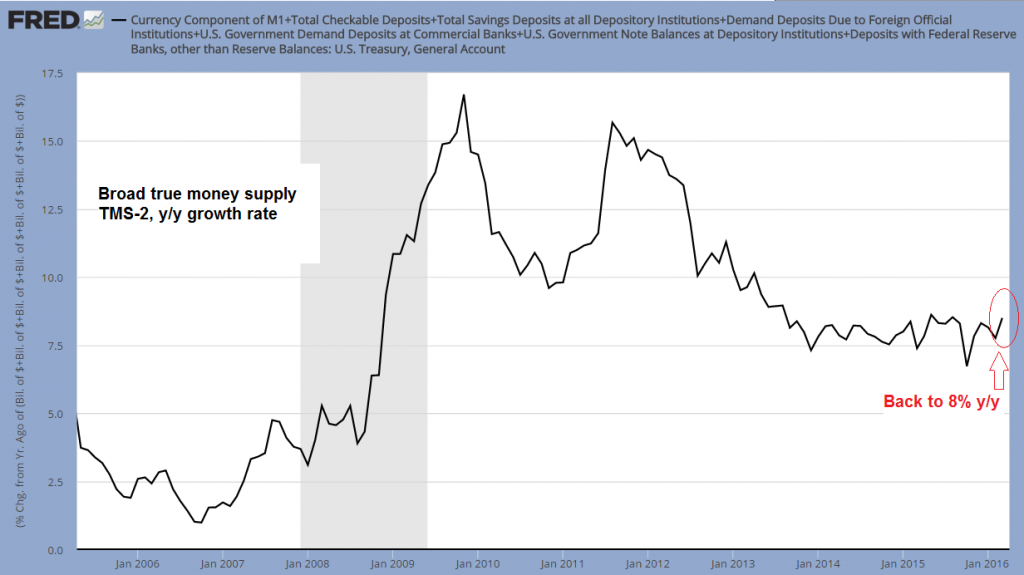
Given the large stock of capital that has already been accumulated in the past and the fact that even during booms, more real wealth tends to be produced than is consumed in most cases, monetary pumping can delay the onset of a bust considerably. While there is no more “QE” in the US, money supply growth remains at a historically high level. Broad true money supply growth has re-accelerated to around 8% year-on-year as of March.
Money supply TMS-2, y/y growth rate – click to enlarge. |
 |
The main impetus for money supply growth continues to come from commercial and industrial lending, which is still the fastest growing type of bank credit.
The y/y growth rate of commercial and industrial lending stood at 11.23% as of early April – click to enlarge. |
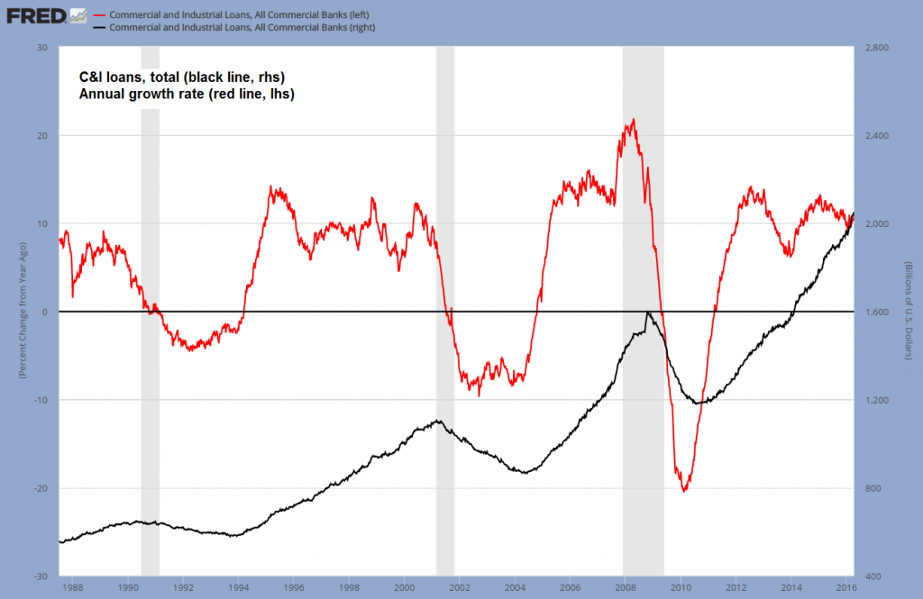 |
Interestingly, this is happening in spite of the combined value of charge-offs and delinquencies in C&I loans rising at a 52% annualized rate as of Q4 2015, the fastest pace since early 2008, and above the peak growth levels observed in 2001.
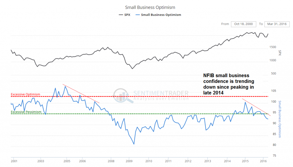
We suspect that quite a bit of this credit growth has fueled financial engineering in the form of share buybacks, M&A activity and even dividend financing. This is helping to keep asset prices elevated for the time being. Small businesses are however no longer very enthusiastic – the NFIB small business optimism indicator has peaked with the end of QE3, along with the oil price:
After recovering to a lower high relative to the previous boom, small business confidence has entered a downtrend – click to enlarge. |
 |
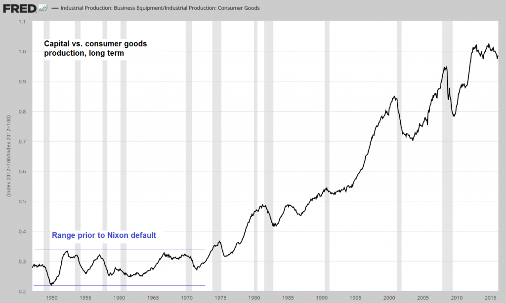
Lastly, here is a long term chart of the capital goods to consumer goods production ratio. This reflects partly the shift in global production mentioned above, but mainly the massive credit expansion that has been set into motion since the gold exchange standard was abandoned with Nixon’s 1971 default.
Prior to the beginning of this credit expansion, the ratio moved in a broad sideways channel – ever since, it has trended upward. The chart also shows that extended periods of the ratio remaining at a high level after reaching a peak are fairly rare.
Conclusion
The economy’s capital structure remains imbalanced as a result of the enormous amount of monetary pumping since 2008 (total TMS-2 growth since then: approx. 128%). There is a limit to this though, even if it cannot be quantified. What can be stated though is that the greater the boom, the greater the eventual bust usually is. There are now more and more indications that a decisive inflection point may be quite near.
Charts by: St. Louis Federal Reserve Research, Atlanta Federal Reserve, SocGen, SentimenTrader

