Anatomy of Waterfall Declines In an article published in these pages in early March, I have discussed the similarities between the current chart pattern in the S&P 500 Index compared to the patterns that formed ahead of the crashes of 1929 and 1987, as well as the crash-like plunge in the Nikkei 225 Index in 1990. The following five similarities were decisive features of these crash patterns: – a rally along a clearly discernible trendline on a linear chart – an accelerated move toward a peak at the end of the advance – an initial decline testing the trendline – a counter-trend rebound – a break of the trendline After the trendline was broken, waterfall declines began in the three antecedents of 1929, 1987 and the
Topics:
Dimitri Speck considers the following as important: Chart Update, Debt and the Fallacies of Paper Money, Featured, newslettersent, The Stock Market
This could be interesting, too:
Nachrichten Ticker - www.finanzen.ch writes Die Performance der Kryptowährungen in KW 9: Das hat sich bei Bitcoin, Ether & Co. getan
Nachrichten Ticker - www.finanzen.ch writes Wer verbirgt sich hinter der Ethereum-Technologie?
Marc Chandler writes March 2025 Monthly
Mark Thornton writes Is Amazon a Union-Busting Leviathan?
Anatomy of Waterfall Declines
In an article published in these pages in early March, I have discussed the similarities between the current chart pattern in the S&P 500 Index compared to the patterns that formed ahead of the crashes of 1929 and 1987, as well as the crash-like plunge in the Nikkei 225 Index in 1990. The following five similarities were decisive features of these crash patterns:
– a rally along a clearly discernible trendline on a linear chart
– an accelerated move toward a peak at the end of the advance
– an initial decline testing the trendline
– a counter-trend rebound
– a break of the trendline
After the trendline was broken, waterfall declines began in the three antecedents of 1929, 1987 and the Nikkei in 1990. In early March, I pointed out that the decisive development was the break of the trendline on the second test. What has happened since then?
A Waterfall Decline Threatens After the Trendline BreakThis time the rebound from the initial test was a comparatively lengthy affair. However, prices ultimately retreated again and last Friday, March 23, the broad US stock market indeed broke through the trendline. Below is an updated three year daily chart of the S&P 500 Index with the trendline. |
S&P 500 Large Cap Index, Apr 2015 - Mar 2018(see more posts on S&P 500 Large Cap Index, )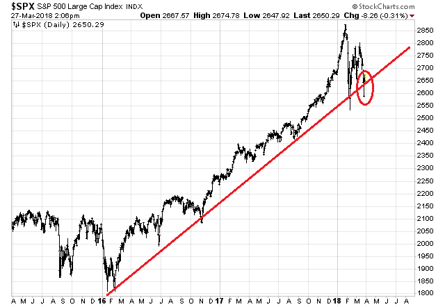 S&P 500 Index: On Friday the trendline was broken (it was briefly regained on Monday, see closing remarks on that point). - Click to enlarge |
Obvious Similarities to 1929, 1987 and Japan in 1990As a reminder, here are charts of the three antecedents for comparison (i.e., DJIA 1986-1987, 1928-1929 and Nikkei 1987-1990). |
Dow Jones, Apr 1986 - Nov 1987(see more posts on Dow Jones, )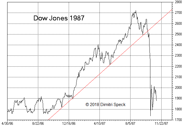 DJIA with trendline, 1986 – 1987: after the break of the trendline, prices declined rapidly. - Click to enlarge |
| The similarities are astonishing: prices rise along the trendline, then the advance accelerates and peaks, the trendline survives an initial test and a rebound commences. |
Dow Jones, Jan 1928 - Aug 1929(see more posts on Dow Jones, )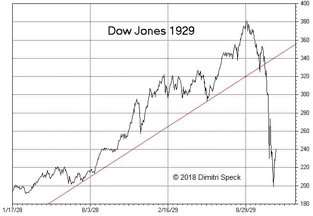 DJIA 1928 – 1929: once again the market crashed after the second test of the trendline failed. - Click to enlarge |
| A second test of the trendline fails, and after the indexes break through, a water-fall decline begins. |
Nikkei Jun 1987 - Jul 1990(see more posts on Nikkei, )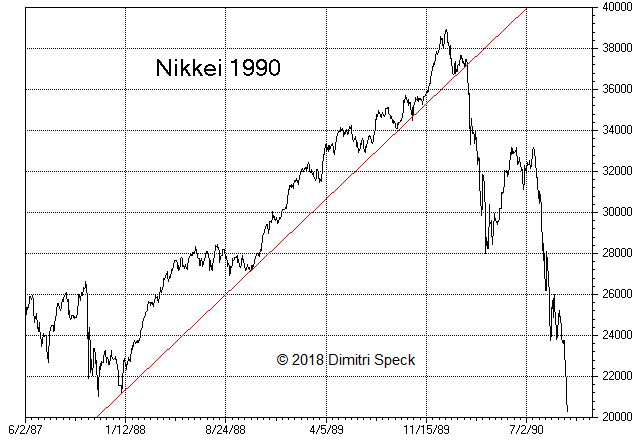 - Click to enlarge |
Trendline Break Approximately 50 Days After the PeakWith the break of the trendline last Friday the table showing the temporal distance between decisive turning points can be updated as well. The table shows the time between these points in calendar days after the respective market tops. The next row, “peak of rebound”, shows the number of days that passed between the market peak until the end of the rebound following the first trendline test. This time there were two peaks, one after 31 days and another after 42 days, with the second peak slightly higher than the first. The rebound peaks were grouped closely together in all cases, as they were put in 37 – 42 days after the top. The last row shows the day on which the break of the trendline took place. In the previous cases it happened 44 to 53 calendar days after the market had topped. With the break last Friday we are looking at 56 days in the current pattern. Once again the trendline breaks are grouped closely together in all cases. |
USA Calendar Days After the Peak, 1929 - 2018 The row designated “initial trend line test” shows the number of days that passed between the top and the first test of the trendline. - Click to enlarge 30 calendar days passed e.g. in 1929, in the current chart pattern only 13 days (market peak on January 26 2018, initial test of the trend line on February 8). |
Initial Target for the S&P 500 Index: 1,900Another conspicuous feature of the three antecedents 1929, 1987 and Nikkei 1990 was also the similarity in the extent of the declines. In the first major wave down, prices fell to the starting points of the respective trendlines. Should a comparable waterfall decline once again be in the offing, the initial target for the S&P 500 Index would be 1,900 points, equivalent to a 34% loss from the top. Thereafter, prices embarked on very different paths in the previous cases: – after the crash of 1929, prices declined by almost 90% over the next 2.8 years – in 1987, after a spectacular one-day loss of 22.61%, the market had put the worst behind it – after the rapid decline of 1990, Japan’s stock market remained mired in a lengthy secular bear market that eventually bottomed after having lost 82 percent – almost 30 years after the top. South Seas BubbleIn addition I wanted to show what happened in the famous South Seas Bubble of the early 18th century. While it is in many ways quite different from the modern-day examples discussed above, one can quite clearly discern a few interesting similarities: the rise along a trendline, an accelerated rally into the peak, followed by a waterfall plunge after the trendline was broken. |
British Stock Prices, 1719 - 1721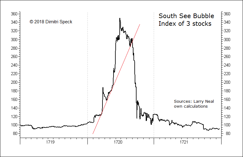 British stock prices 1719 – 1721 (an index constructed from three major stocks): after the break of the trendline, prices fell back all the way to the starting point of the bull market. - Click to enlarge |
Elevated Crash Danger
With the recent trendline break, the pattern of the US stock market continues to look similar to that of the three crash antecedents. Other factors are of crucial importance for the stock market as well, such as its extreme fundamental overvaluation, rising interest rates and tensions over global trade.
Of course a crash is by no means certain or preordained, particularly the strong counter-trend move of Monday March 26 (which regained the trendline) does give us pause. However, since the initial rebound ended with a kind of double-top this time, perhaps there will also be two trendline breaks in close succession. Overall, there is now clearly an elevated probability that a waterfall decline lies ahead.
Chart and data sources: Bigcharts, Dow Jones, Nikkei, Larry Neal, author’s own calculations and charts
Tags: Chart Update,Featured,newslettersent,The Stock Market